brief: For Carly Law Typography 1 class, we were required to examine the visual and communicative nuances of various type families and create a two-sided poster that illuminates these aspects of the family.
timeline: 4 weeks
a Gill Sans specimen poster

Goals & Responsibilities
As a designer, I feel a strong sense of responsibility to be intentional and informative in the visual language I construct for myself and my work. With this project, it feels impossible for me to give a whole scope and history of this typeface without acknowledging the troubling past of Eric Gill. While I want to celebrate Gill Sans’ immense cultural impact in shaping English politics, public transportation, signage, and even inspiring so many typefaces to follow, I need to acknowledge the ethical intricacies that accompany freedom and choice in design and ask that we confront this tension by consciously separating face from the typeface.
3 part approach
1
Defacing
villainizing an artist directly alongside their work allows it to be celebrated without the history and complexities of the creator.
2
Responsibility
making intentional, conscious decisions that uphold our ethical standards in every design choice -even something as simple as selecting a typeface - because a single image can speak a thousand words.
3
Reframing
Highlighting the positive cultural impacts of Gill Sans and its own legacy it has created through its adoption into English culture and its continued impact on typography long after Eric Gill has passed.
Early ideation & Feedback
Initial ideation are focused on application and usage → educating and informing to meet the requirements.
After reflection and feedback from peers, I wanted to reframe this project into a narrative that exhibits the larger context at hand.
This is where ‘Separating Face from Typeface' was born; an effective way to highlight both the positive impacts and influences of Gill Sans while also acknowledging and educating about the disturbing past of Eric Gill.
Research Summary
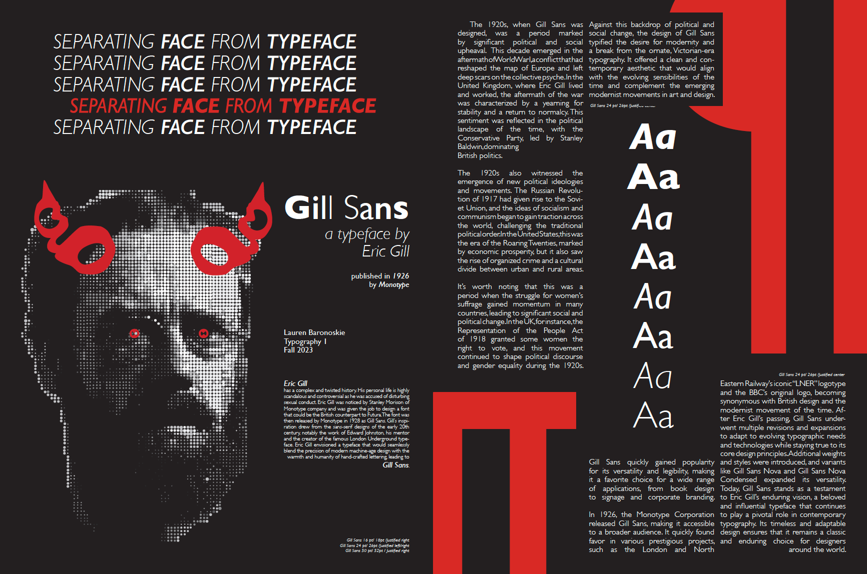
Eric Gill has a complex and twisted history. His personal life is highly scandalous and controversial as he was accused of disturbing sexual misconduct. Eric Gill was noticed by Stanley Morison of Monotype company and was given the job of designing a font that could be the British counterpart to Futura. The font was then released by Monotype in 1928 as Gill Sans. Gill’s inspiration drew from the sans-serif designs of the early 20th century, notably the work of Edward Johnston, his mentor and the creator of the famous London Underground typeface. Eric Gill envisioned a typeface that would seamlessly blend the precision of modern machine-age design with the warmth and humanity of hand-crafted lettering, leading to Gill Sans.
Process
I began with rendering the reference image for the ‘photograph’. A challenge of this project was the restricted use of assets. For graphics, we were only allowed to use letterforms and glyphs of the typeface itself, restricting the use of images.
However, almost every single typeface offers a very special little circle:
the period.
Using half-tone inspired procedural filters on a photograph I was able produce a reference of the image I wanted to create. I can now follow this pattern with periods to create imagery within the constraints of the brief.
Rendering
The next part of this process consisted of actually rendering the image using periods.
Hours and hours of copy and pasting periods, change the fill, and repeat.
Finally, it was about organizing and presenting the written information to be both informative and visually pleasing.
final 2 sided poster