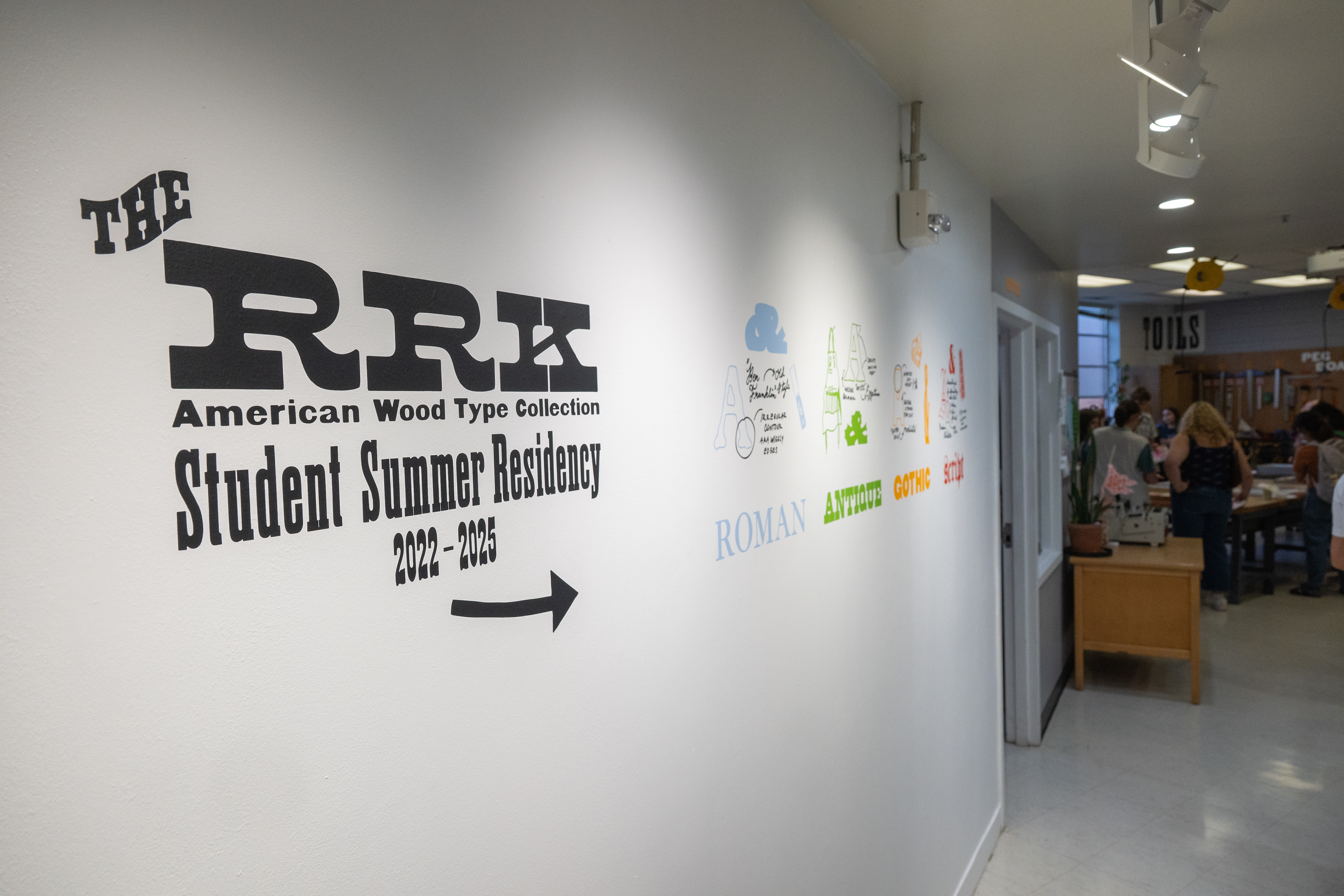
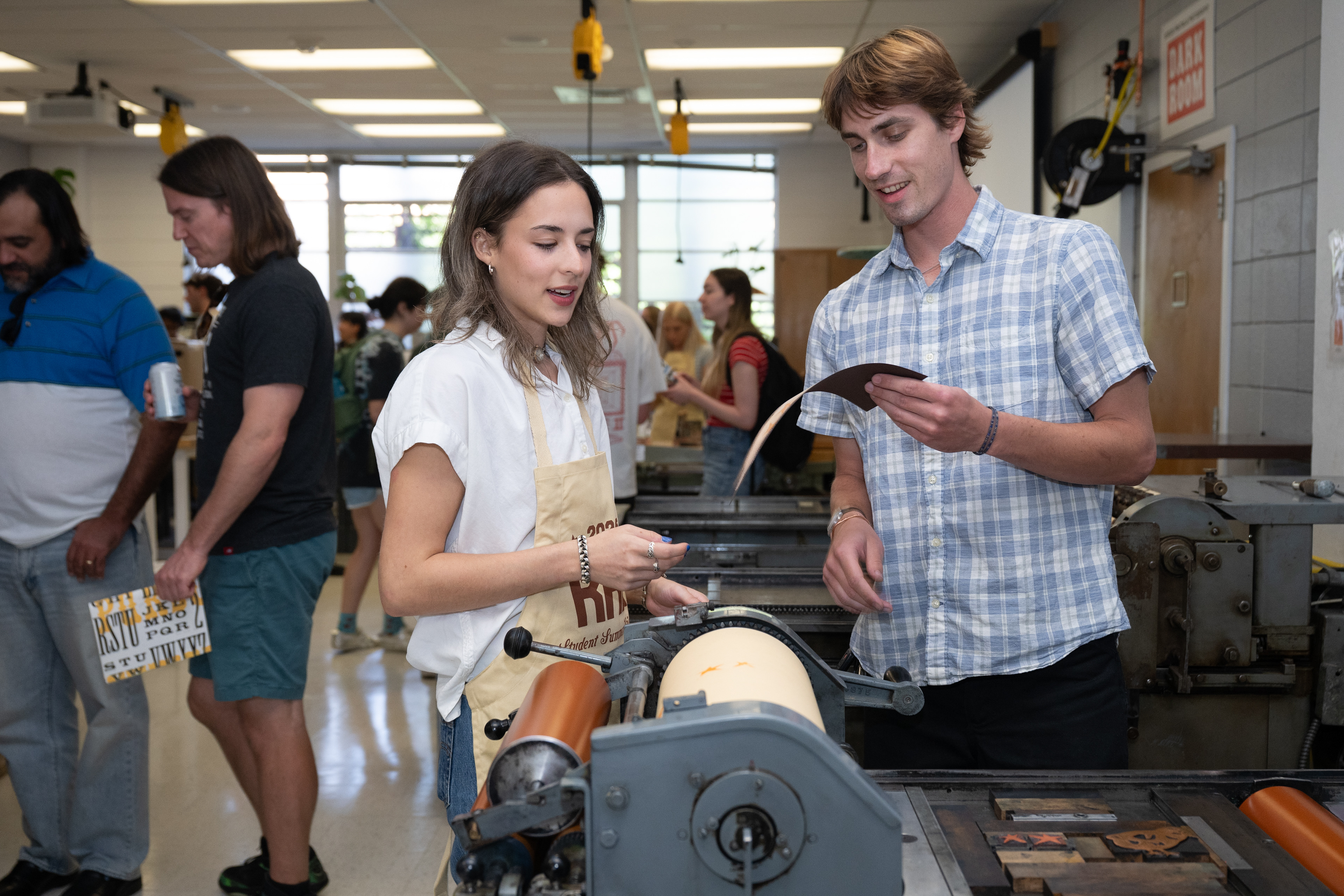
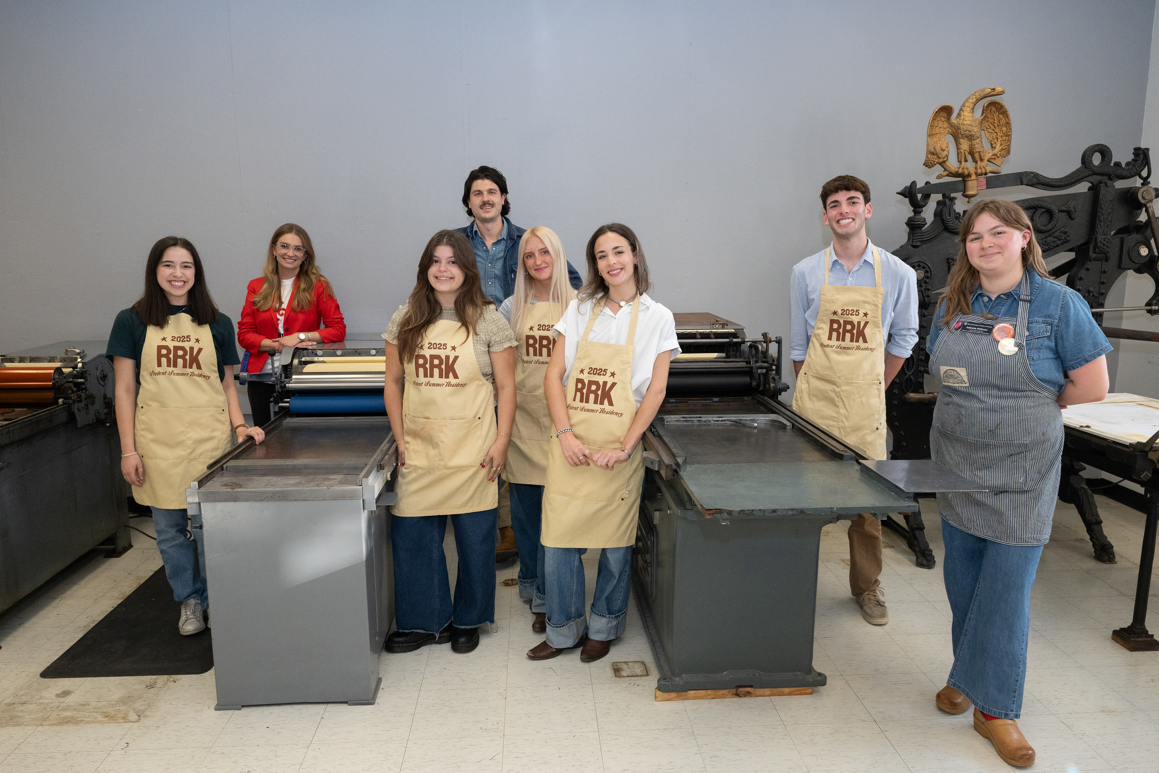
As part of a five-week program with five student residents and design lab staff, I contributed to the ongoing project of recontextualizing Rob Roy Kelly’s wood type collection and producing a new, contemporary folio through letterpress printmaking.
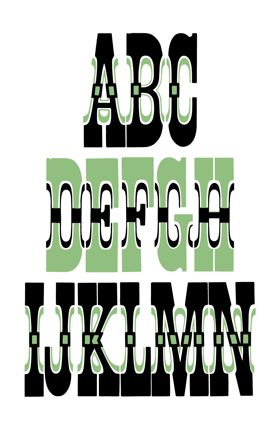
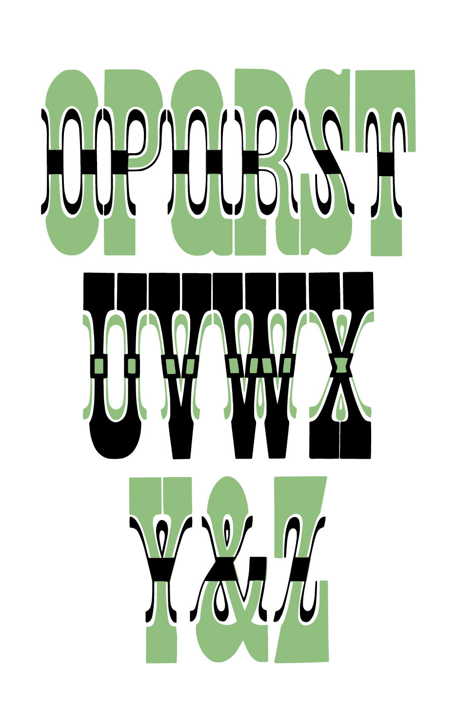
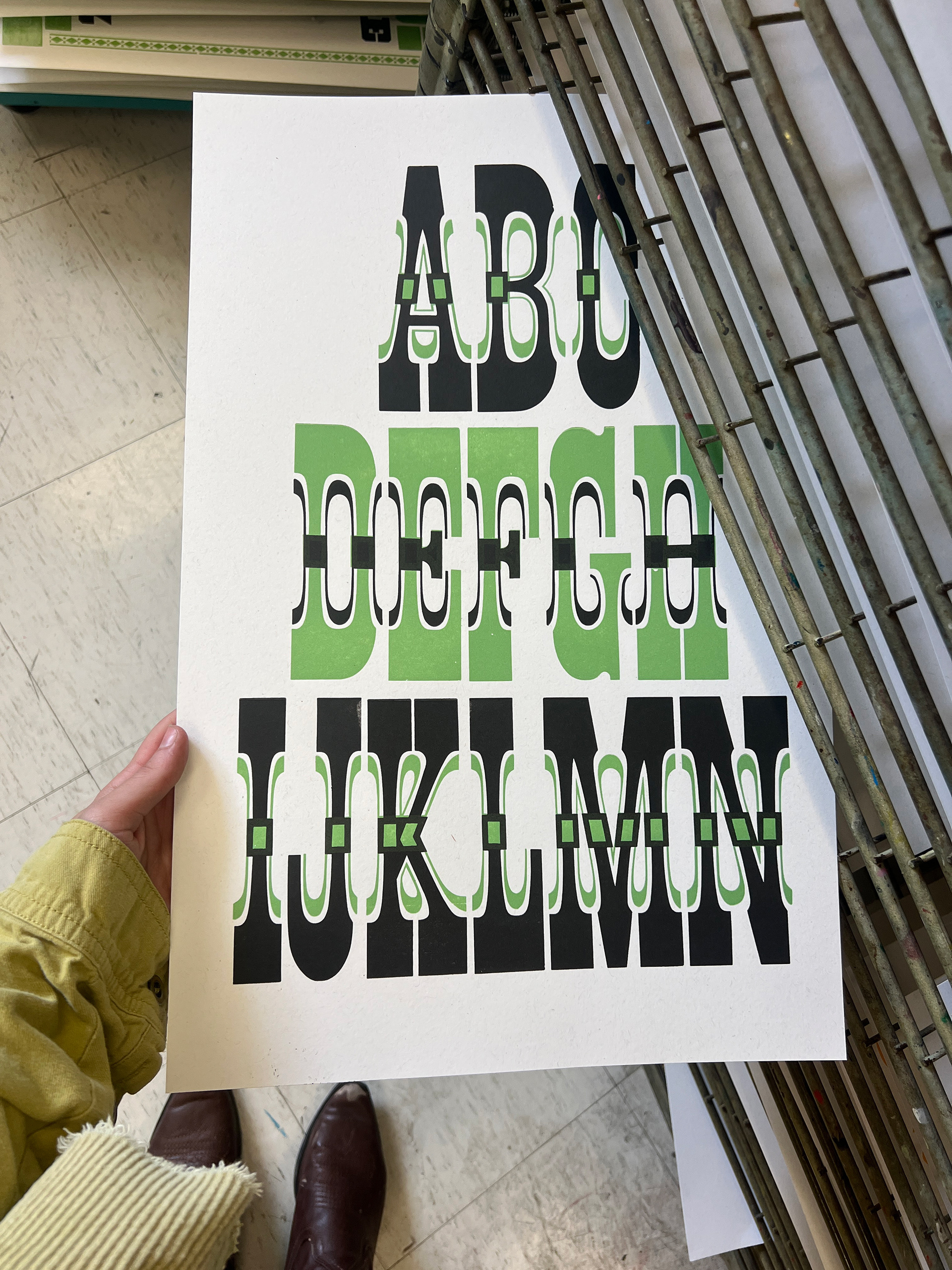
Celtic & Celtic Chromatic
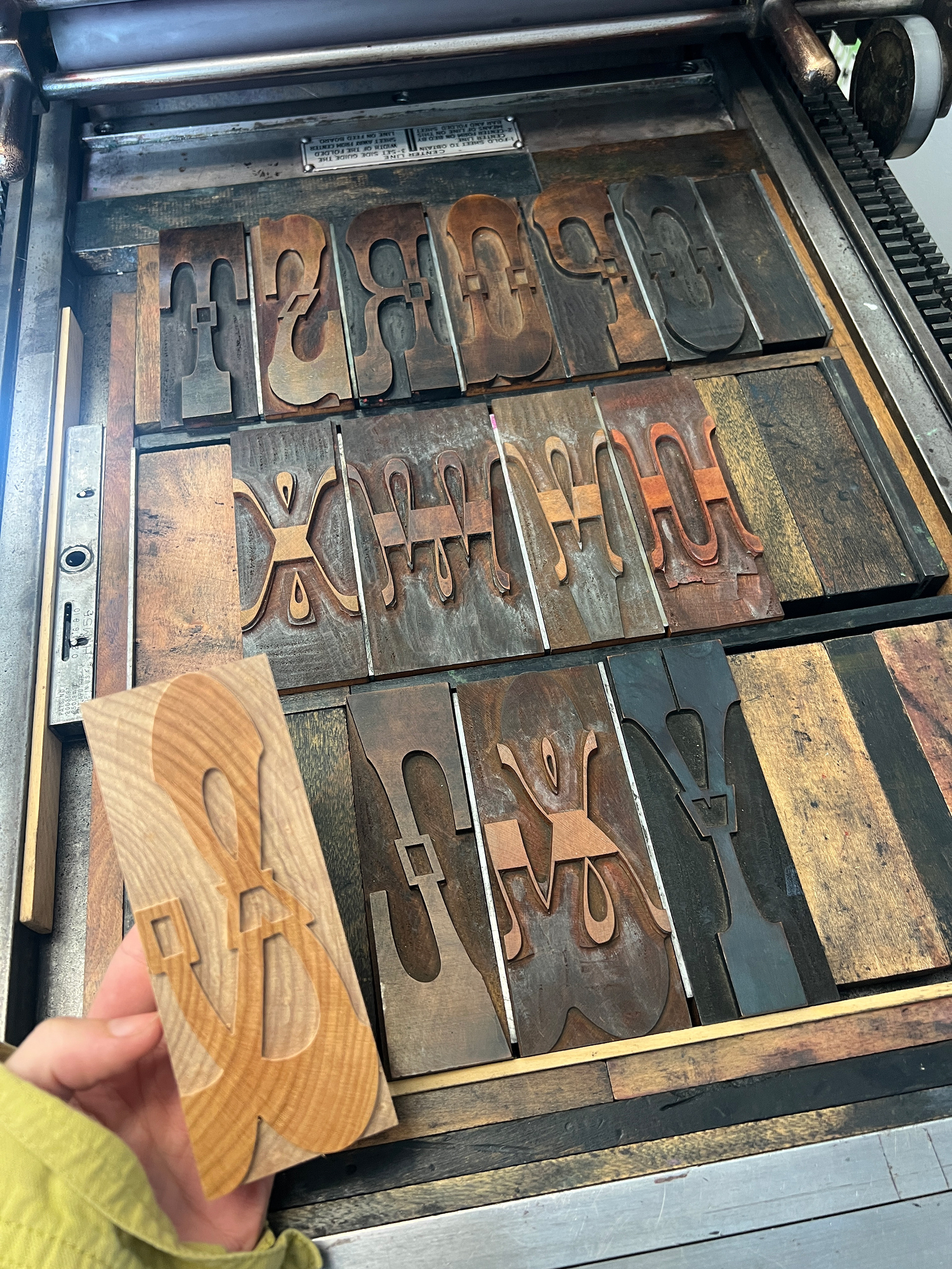
custom cut ampersand
first print of the summer and first time printing a chromatic duo! I wanted the chromatic blocks to feel equally important so I alternated the layer order and color of the rows between the typefaces.
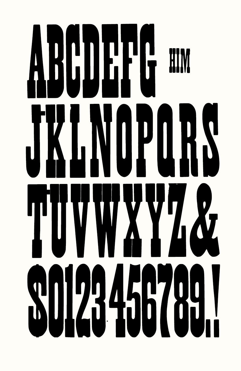
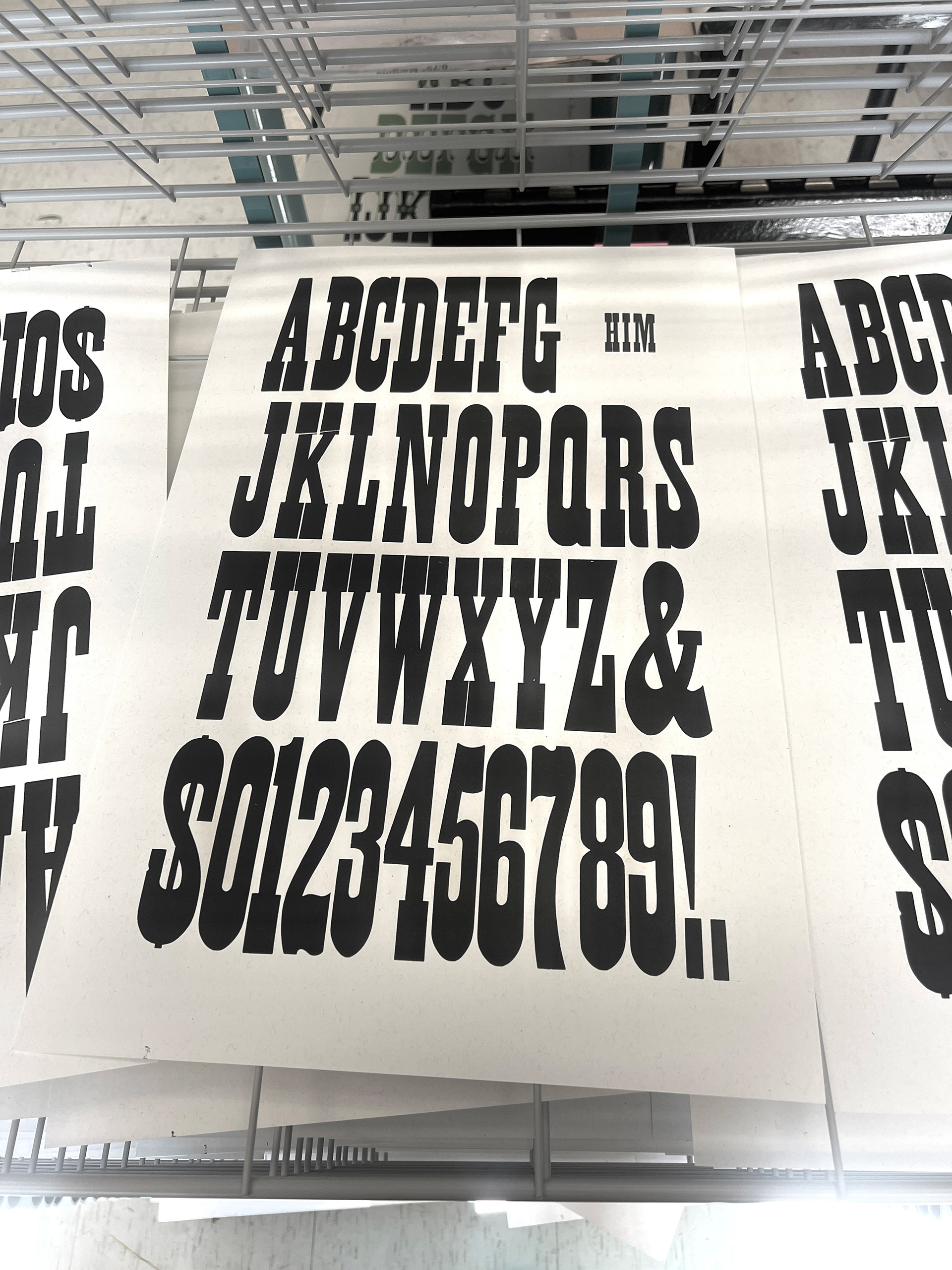
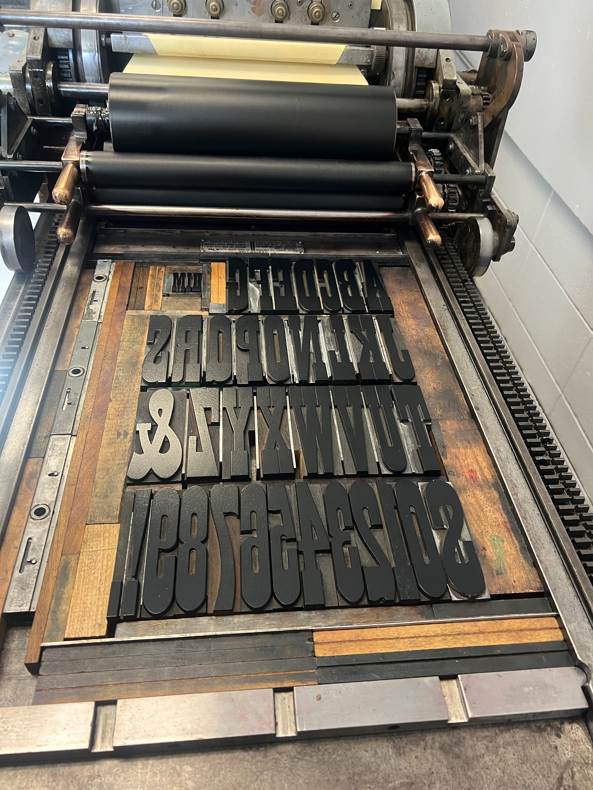
French Antique No. 1 in 8 line & 24 line
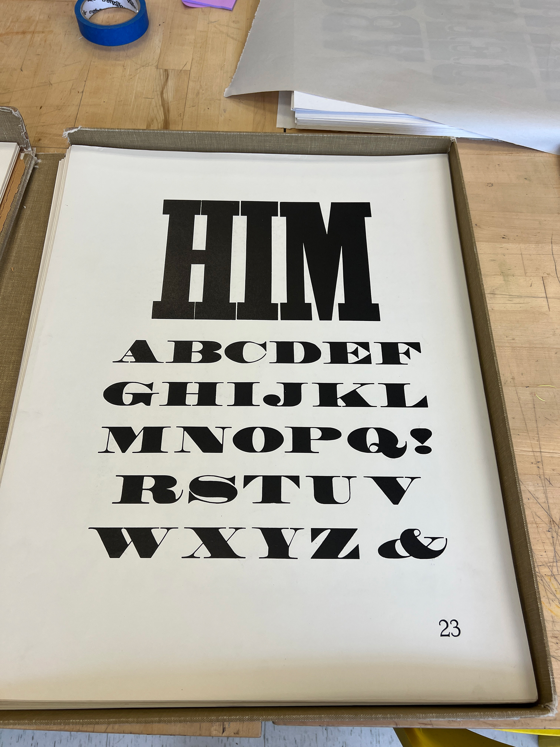
original folio reference
responding directly to the first and largest word printed in the original folio.
More French Antique No. 1 (10 line)
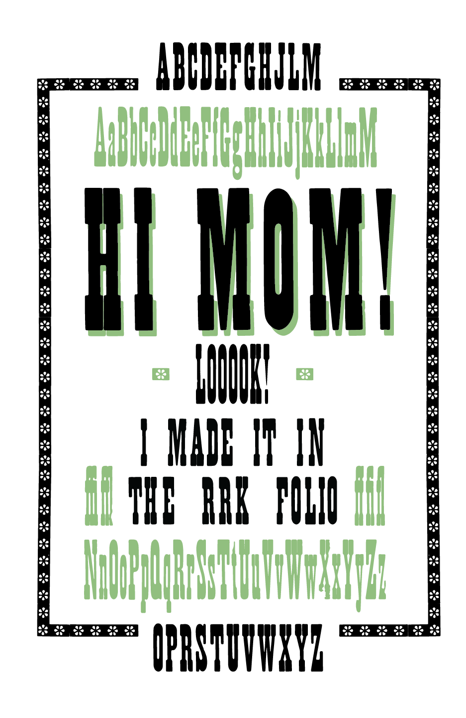
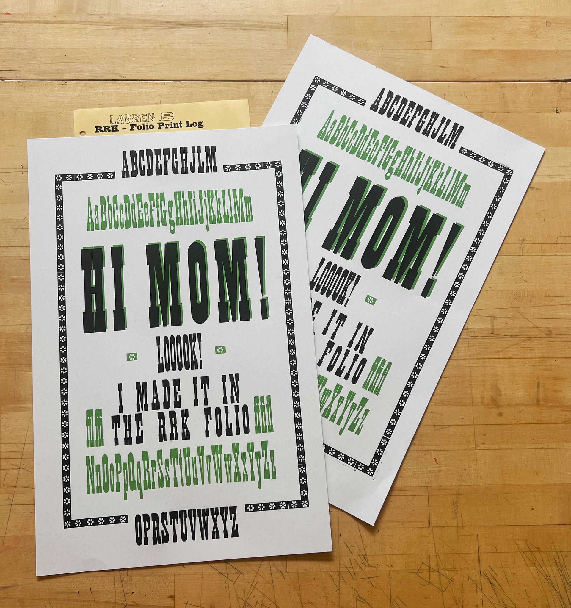
using the rest of French Antique No. 1 in 24 and 8 line. Hi Mom!
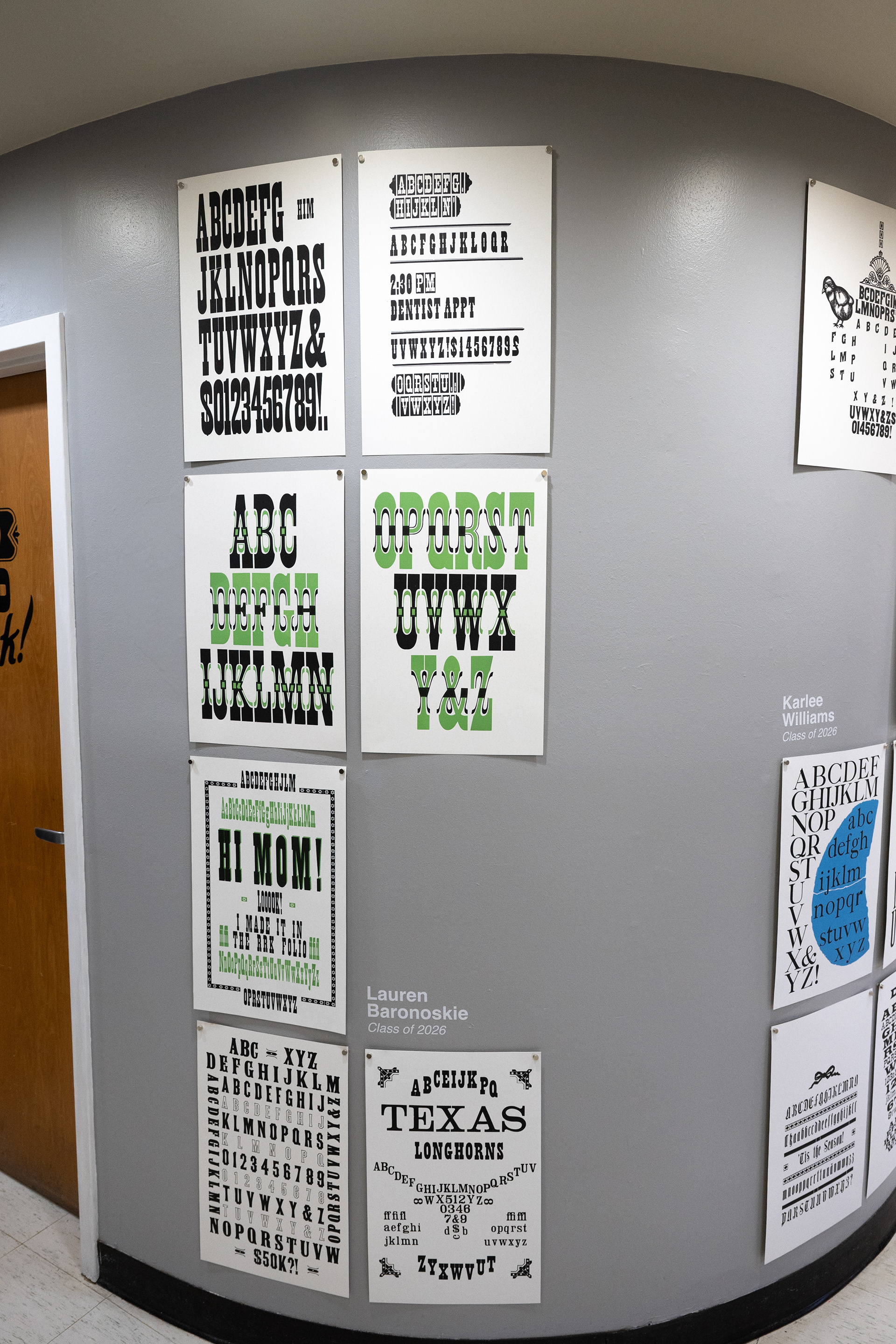
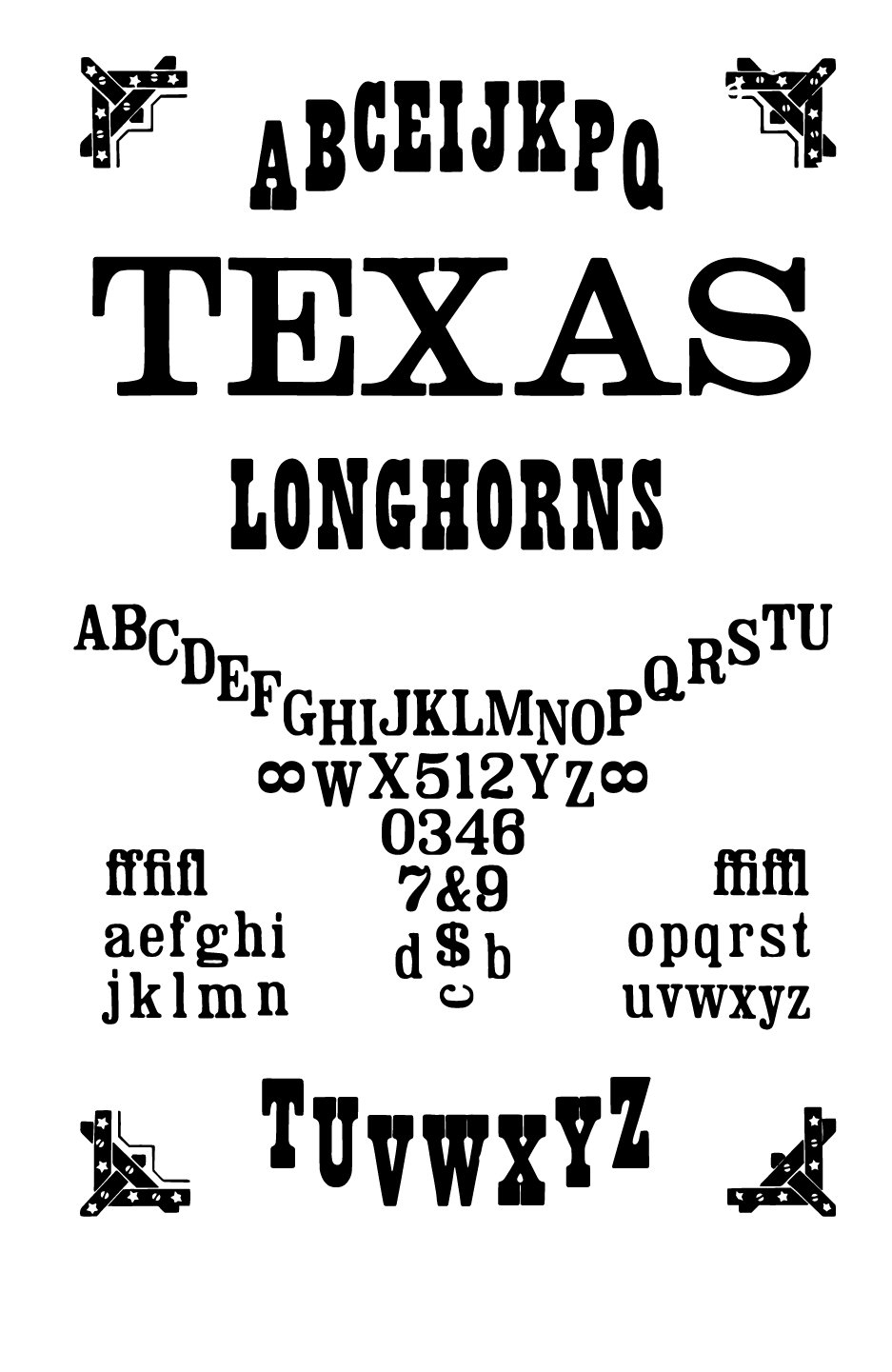
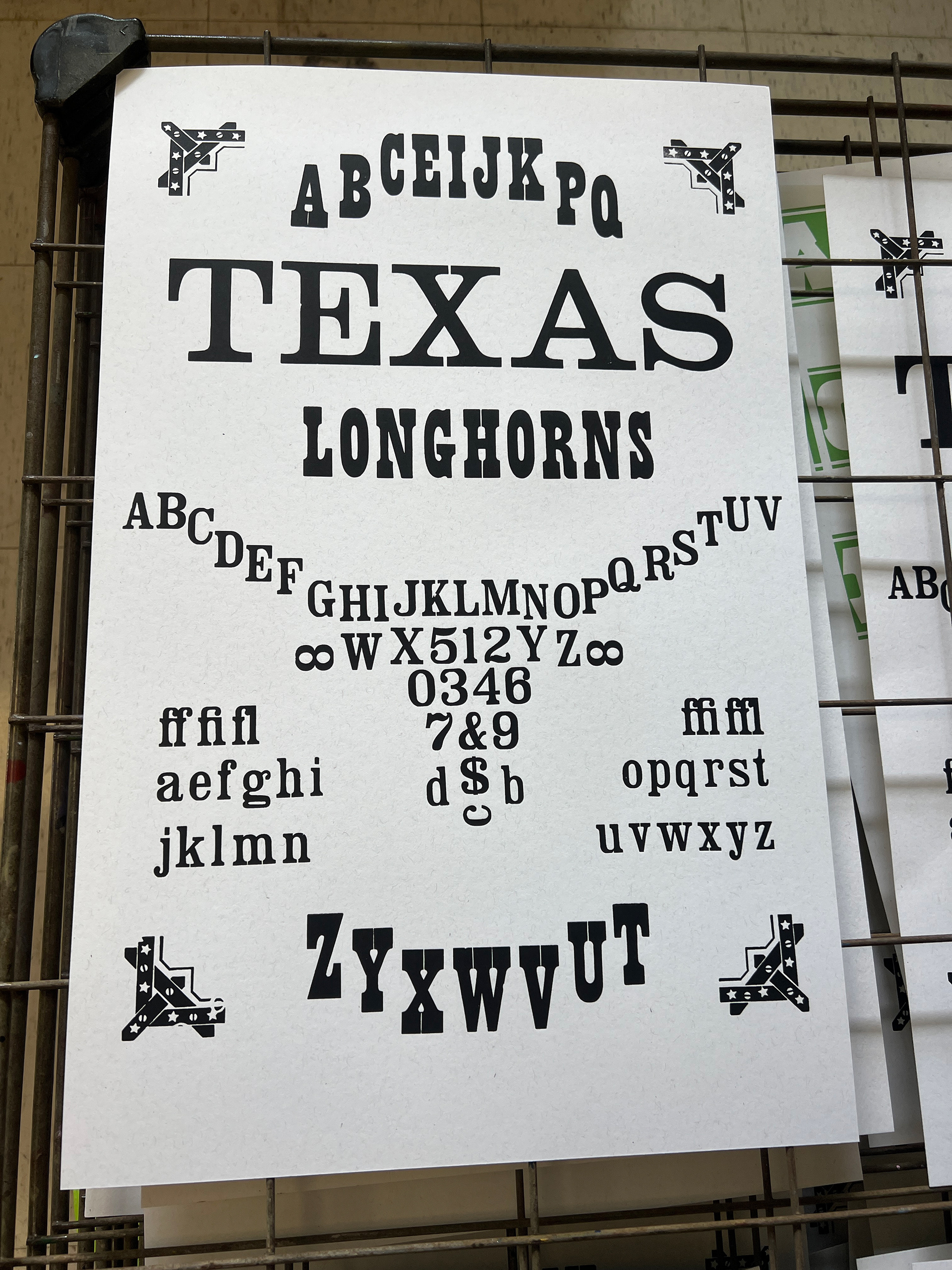
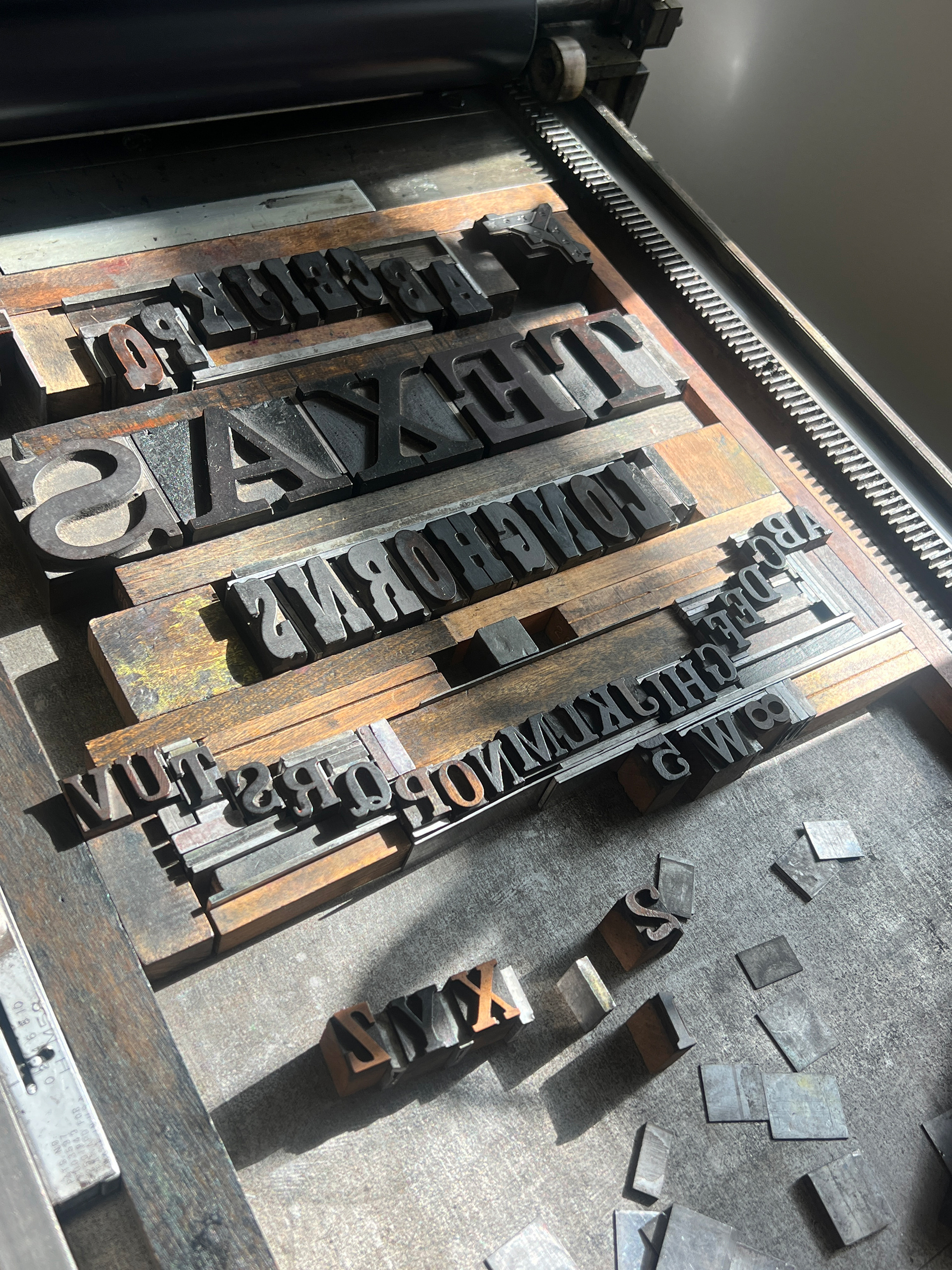
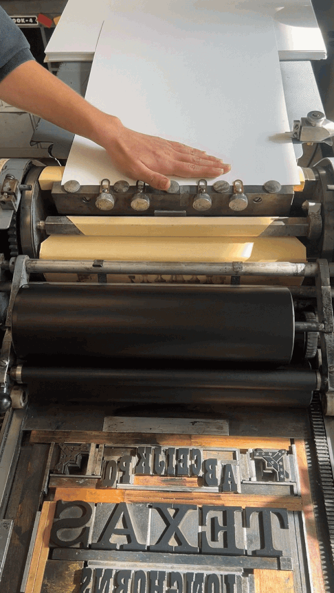
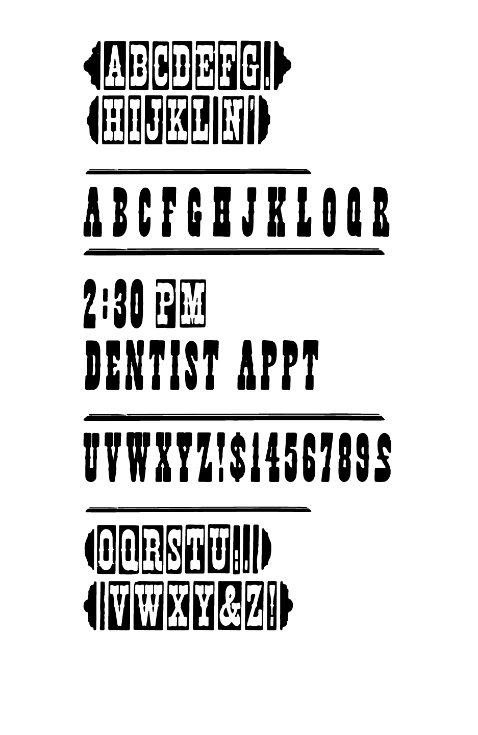
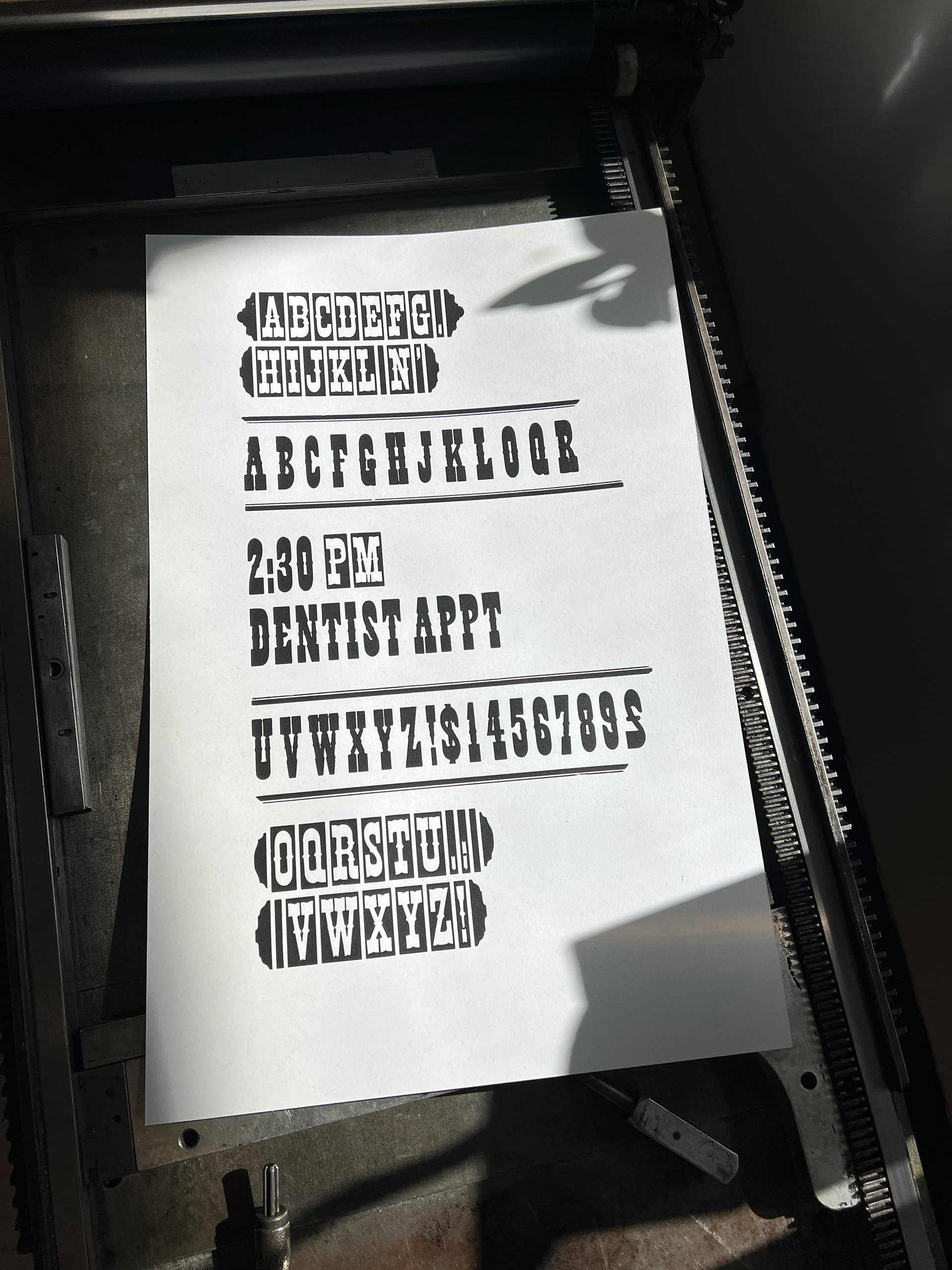
Gothic, Antique Tuscan x condensed, & no. 11
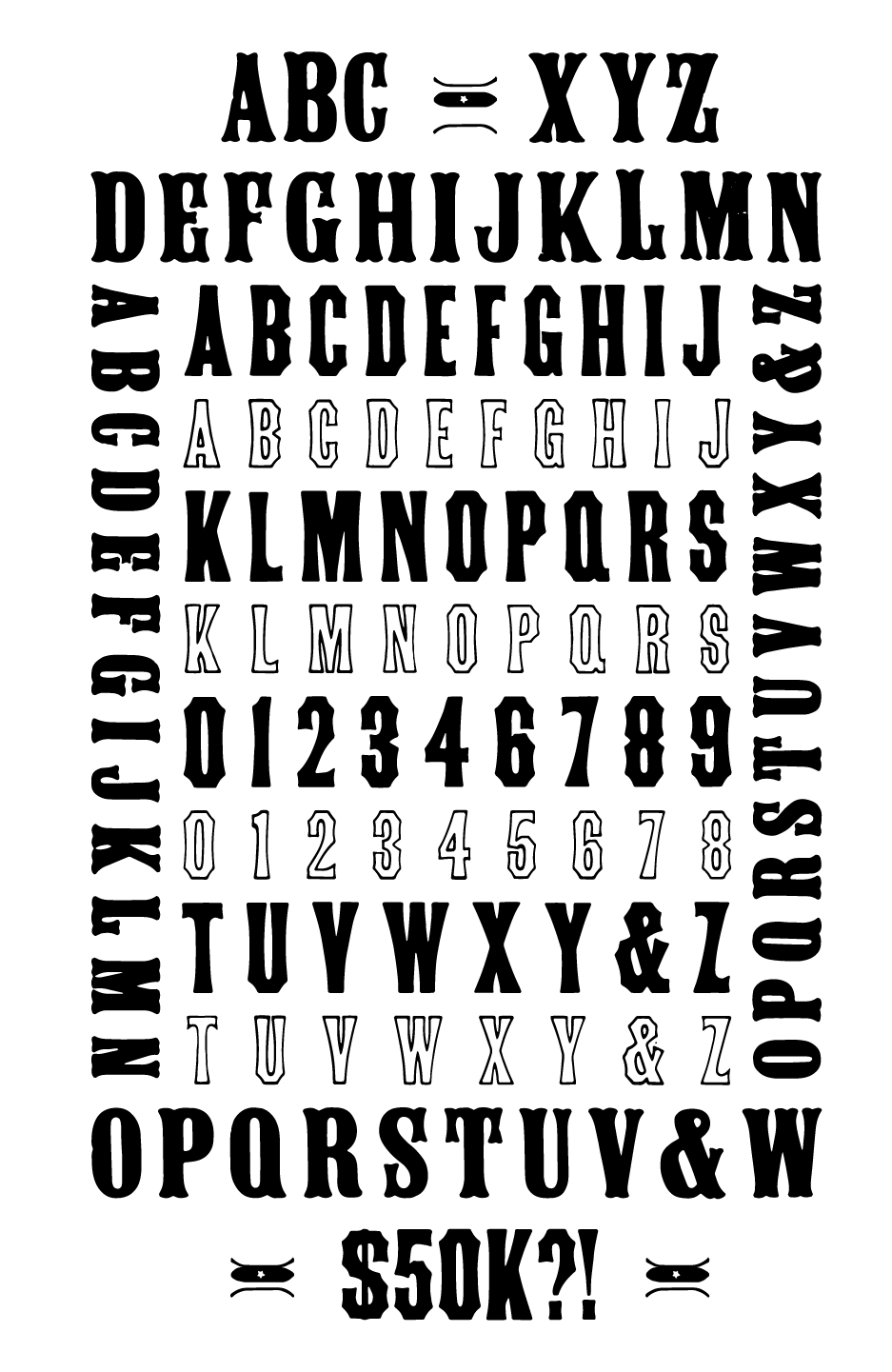
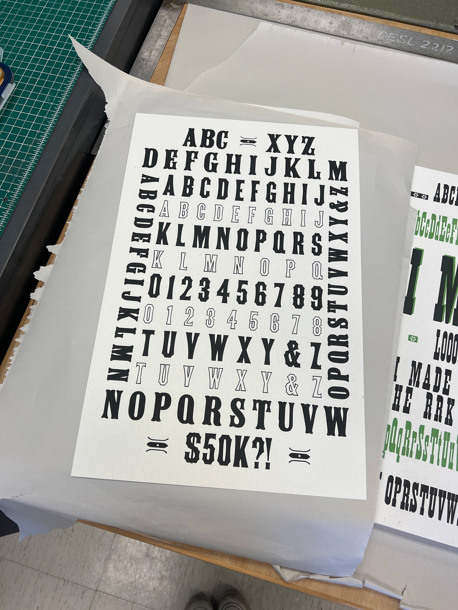
challenging myself to include as many typefaces on a specimen as possible, with $50k referencing the acquisition cost of the collection to the Harry Ransom center.
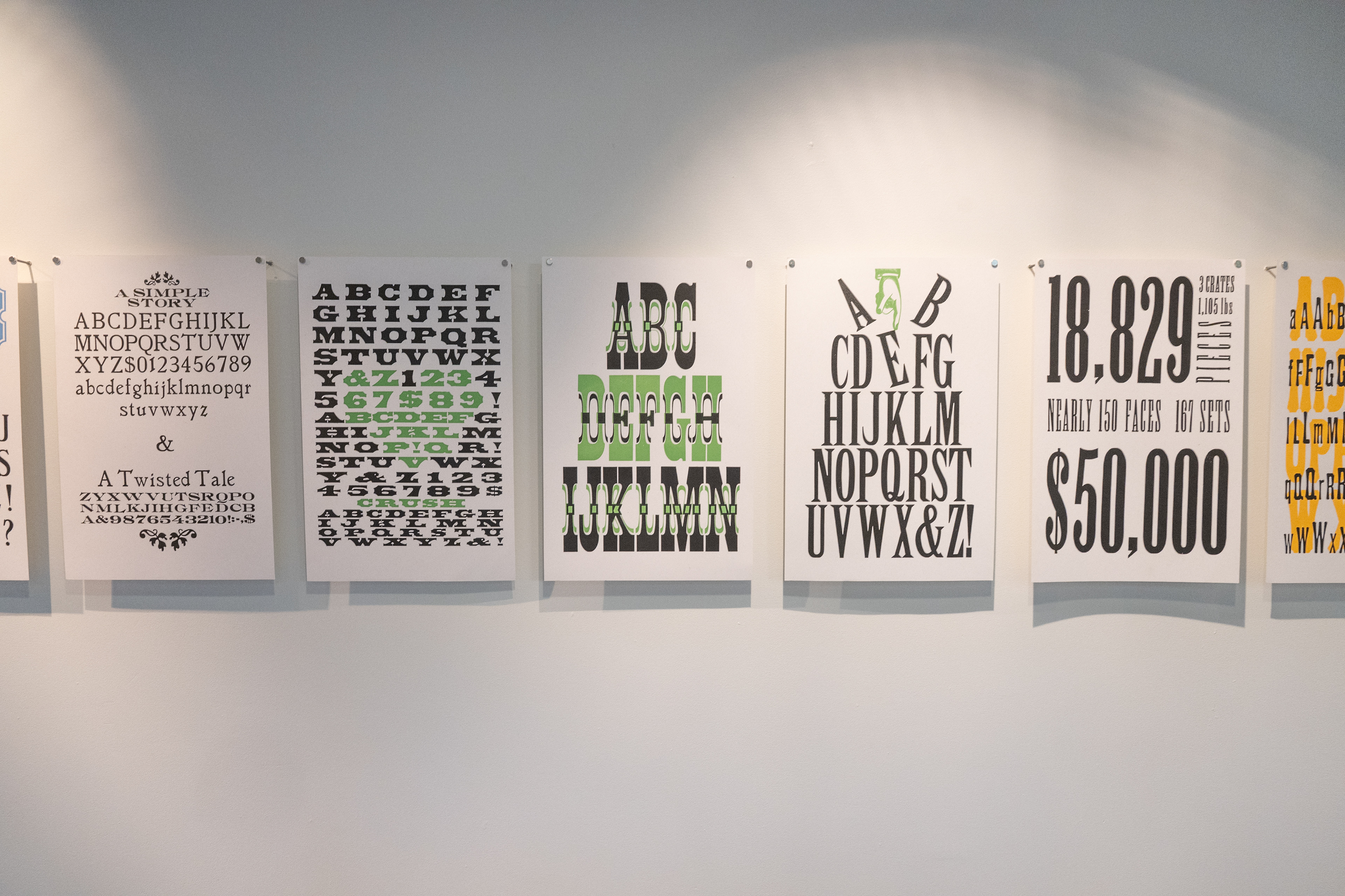
Clarendon & Ionic
exploring imagery through type and more intricate lock ups. Ionic immediately reminded me of the University branding so I wanted to add a touch of school spirit and call to the home of the design lab/collection in the new folio.
No. 501 & Streamer No. 2
a simple, straightforward, and effective print to end the summer. My first time working with rules and streamers as a relaxing way to wrap up the residency!