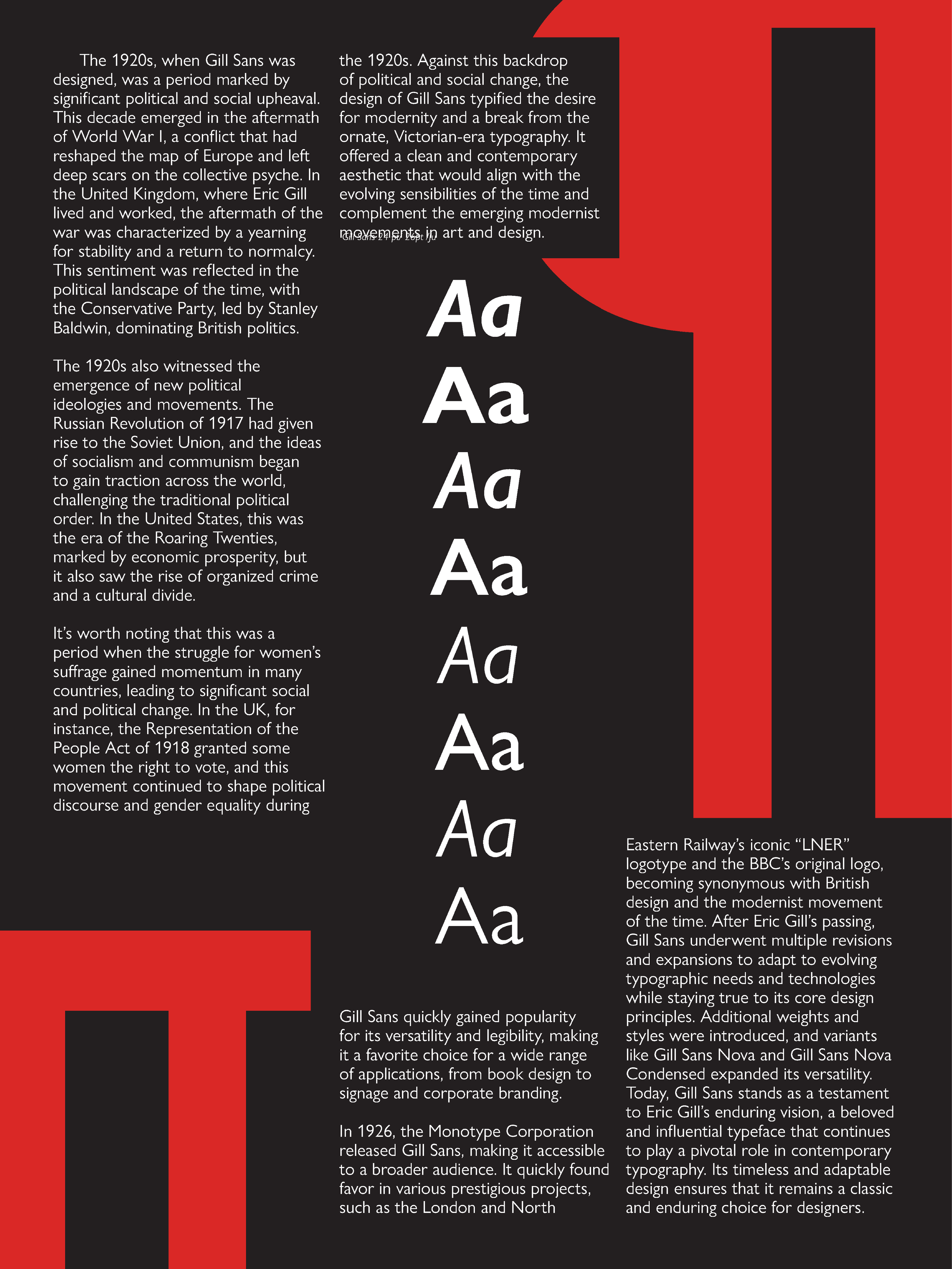
a Gill Sans specimen poster
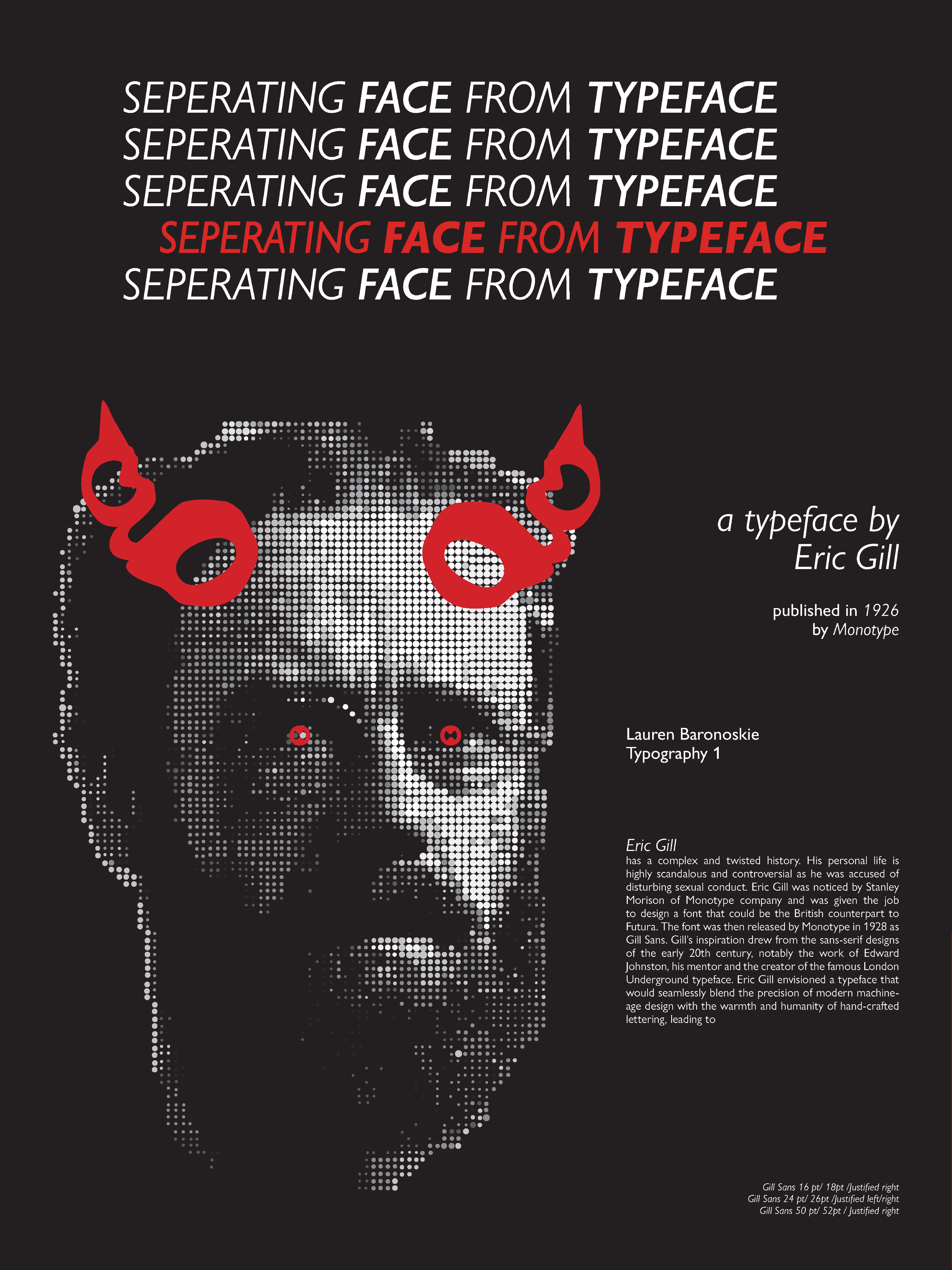
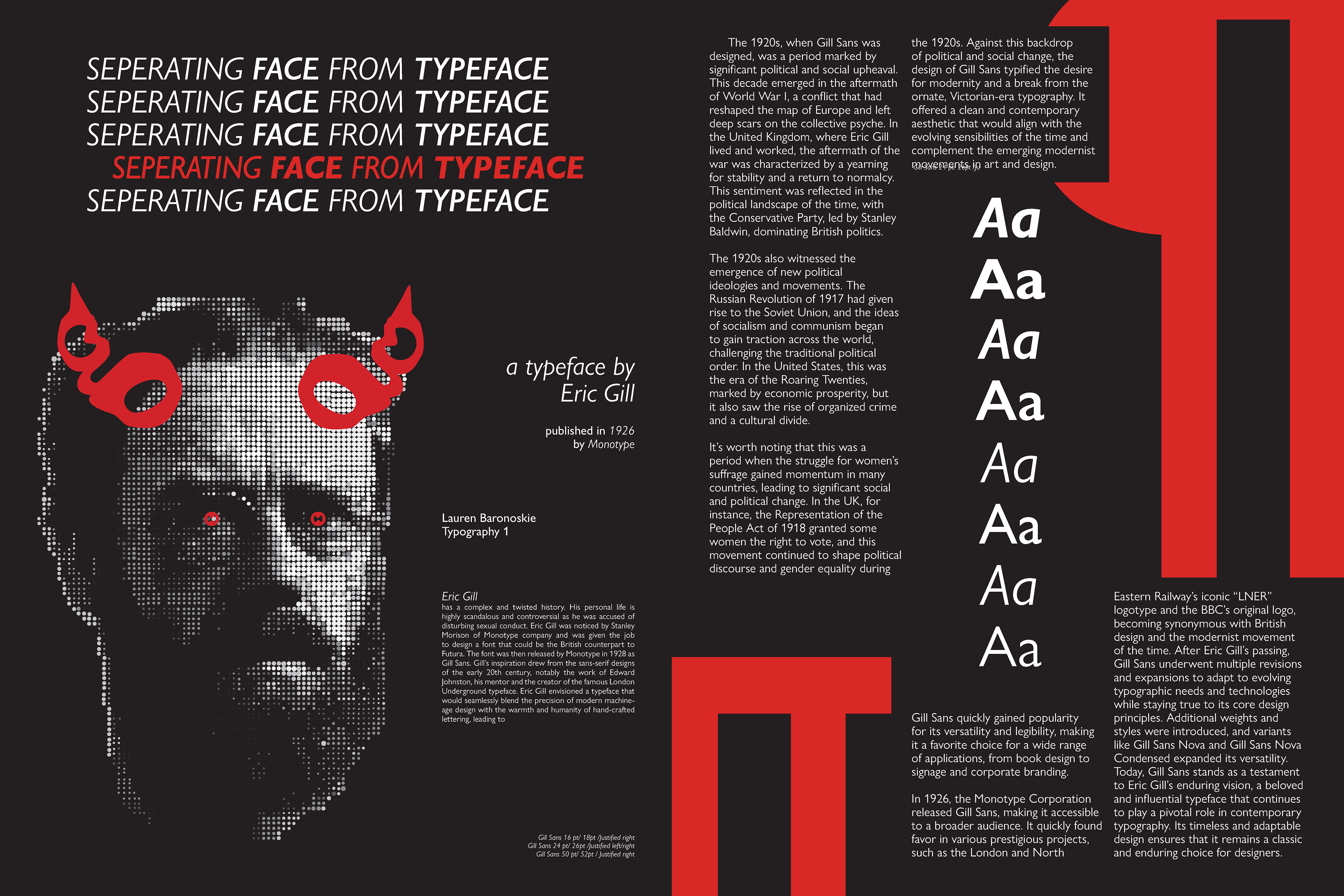
As a designer, I feel a strong sense of responsibility to be intentional and informative in the visual language I construct for myself and my work. With this project, it feels impossible for me to give a whole scope and history of this typeface without acknowledging the troubling past of Eric Gill. While I want to celebrate Gill Sans’ immense cultural impact in shaping English politics, public transportation, signage, and even inspiring so many typefaces to follow, I need to acknowledge the ethical intricacies that accompany freedom and choice in design and ask that we confront this tension by consciously separating face from the typeface.
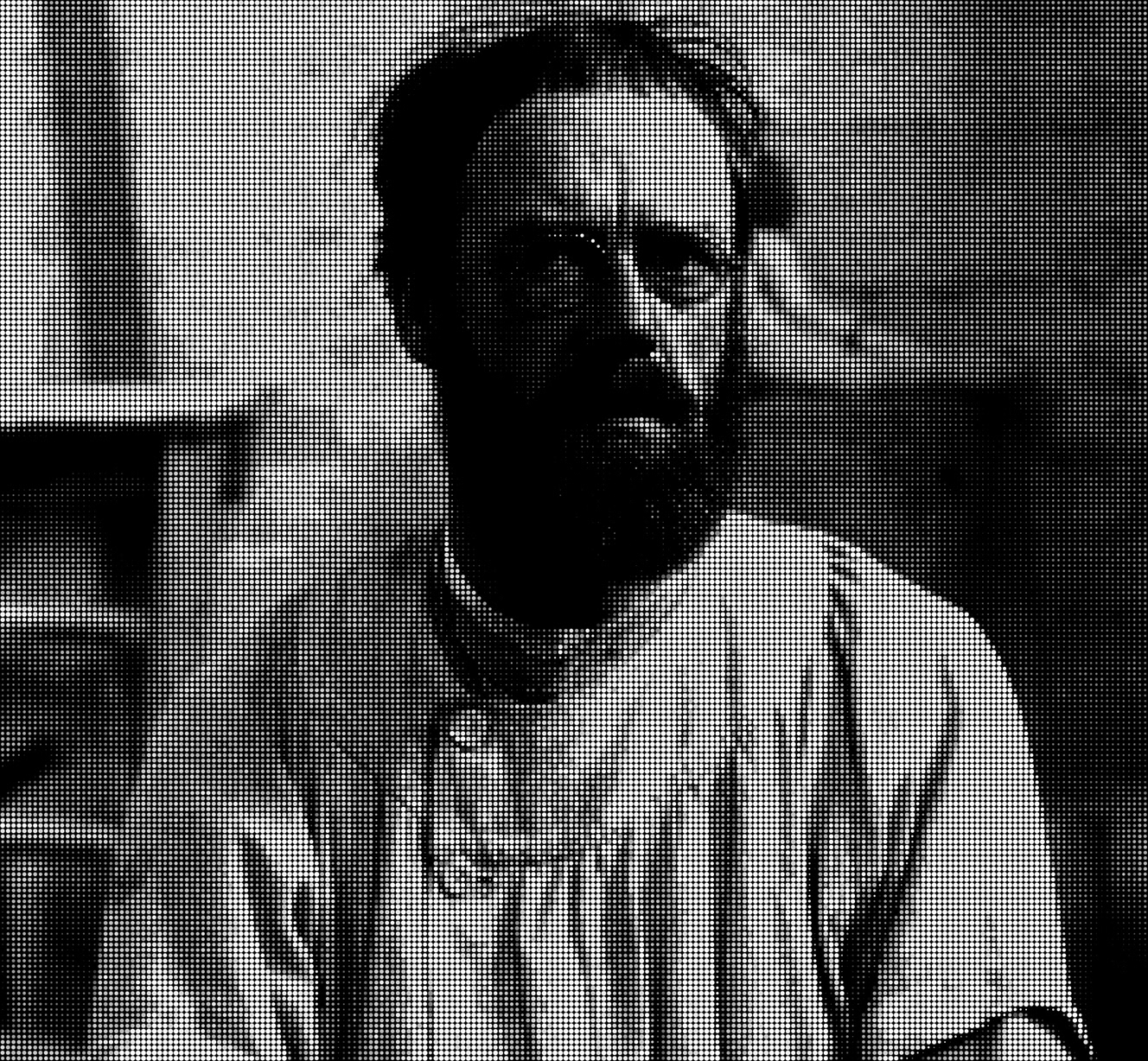
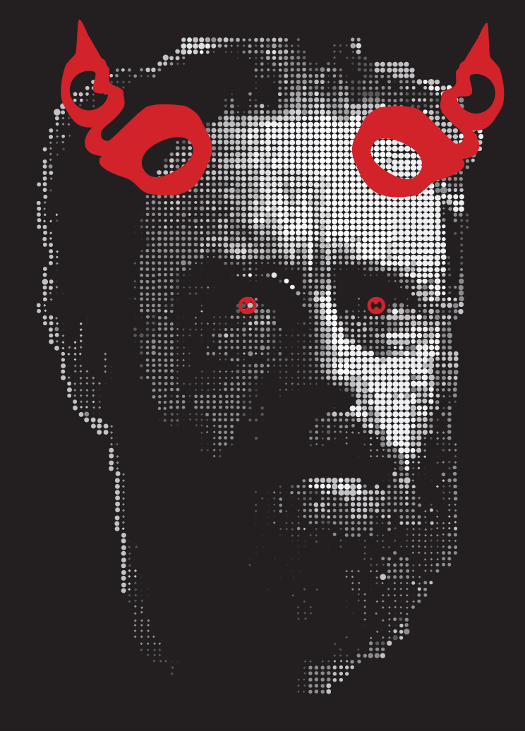
I began with rendering the reference image for the ‘photograph’. A challenge of this project was the restricted use of assets. For graphics, we were only allowed to use letterforms and glyphs of the typeface itself, restricting the use of images.
However, almost every single typeface offers a very special little circle:
the period.
Using half-tone inspired procedural filters on a photograph I was able produce a reference of the image I wanted to create. I can now follow this pattern with periods to create imagery within the constraints of the brief.

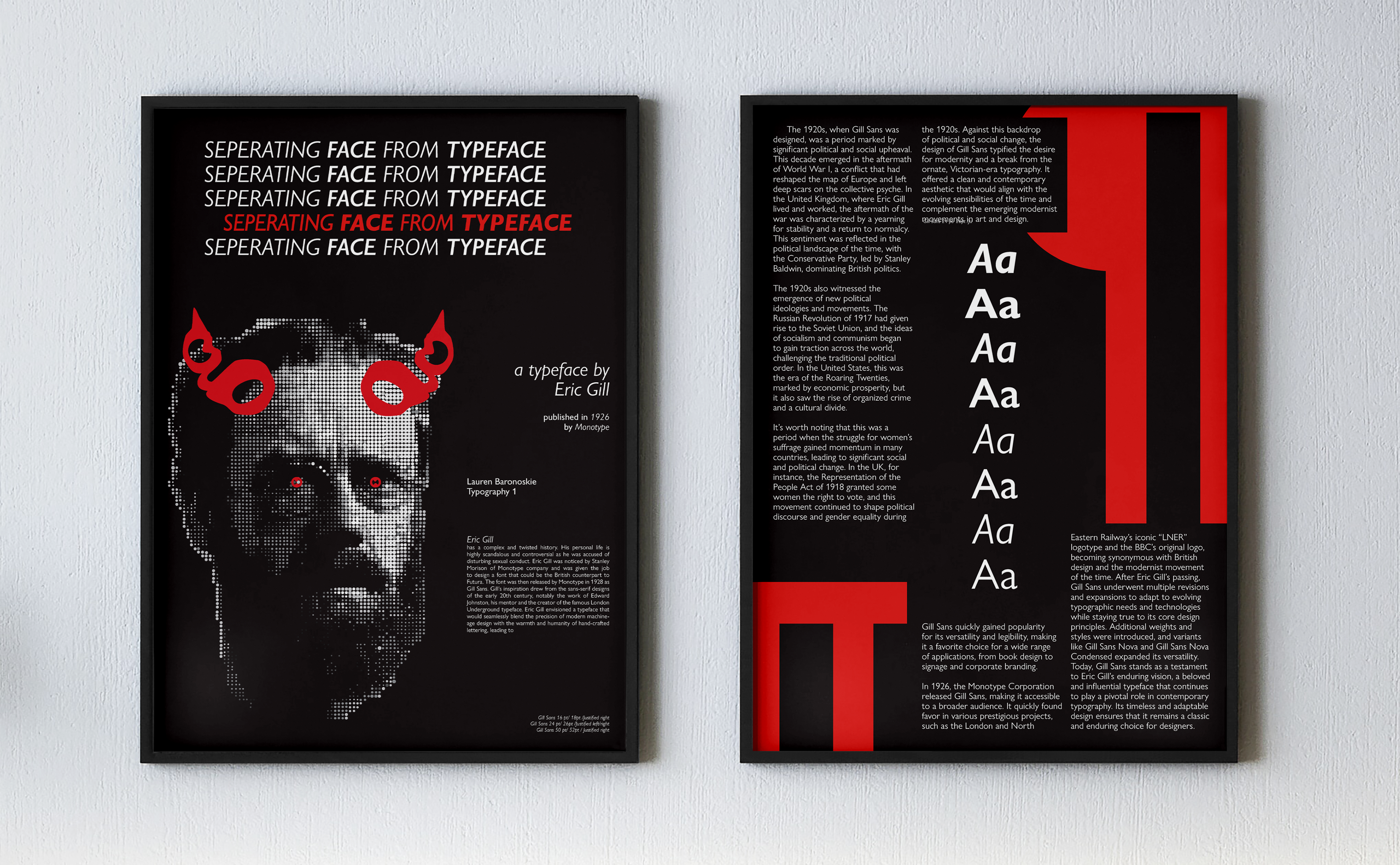
What did I learn?
1
Importance of narrative and storytelling
without a narrative or story to tell, this poster wouldn't have been nearly as strong or effective.
2
New workflows and ways of thinking
moving across programs asked me to adapt workflows for the rendering process. Having this experience, I can now streamline this if I were to approach a similar process again.
3
History lives on
making this poster sparked my interest in design history, but more importantly keeping that information alive and accessible. This has guided many future projects and explorations.