As part of a five-week program with five student residents and design
lab staff, I contributed to the ongoing project of recontextualizing
how letterforms shape type specimen design and
letterpress printmaking.
lab staff, I contributed to the ongoing project of recontextualizing
how letterforms shape type specimen design and
letterpress printmaking.
Celtic & Celtic Chromatic
I began the summer with an ambitious first print: a two-layer chromatic. My goal was to give equal weight to both the original typeface and the chromatic layer, which I achieved through alternating their colors and print order as the rows descended. This approach required close attention to registration, along with many teeny tiny individual adjustments. Because the original ampersand was missing, we cut a new block to complete the final print.
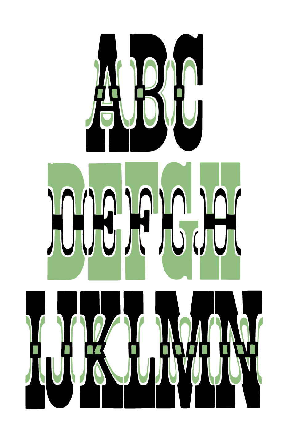
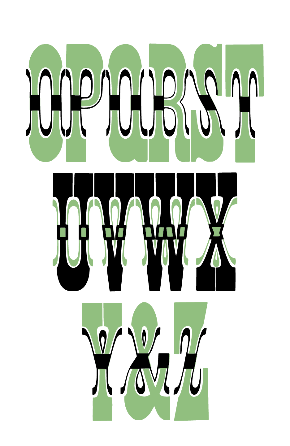
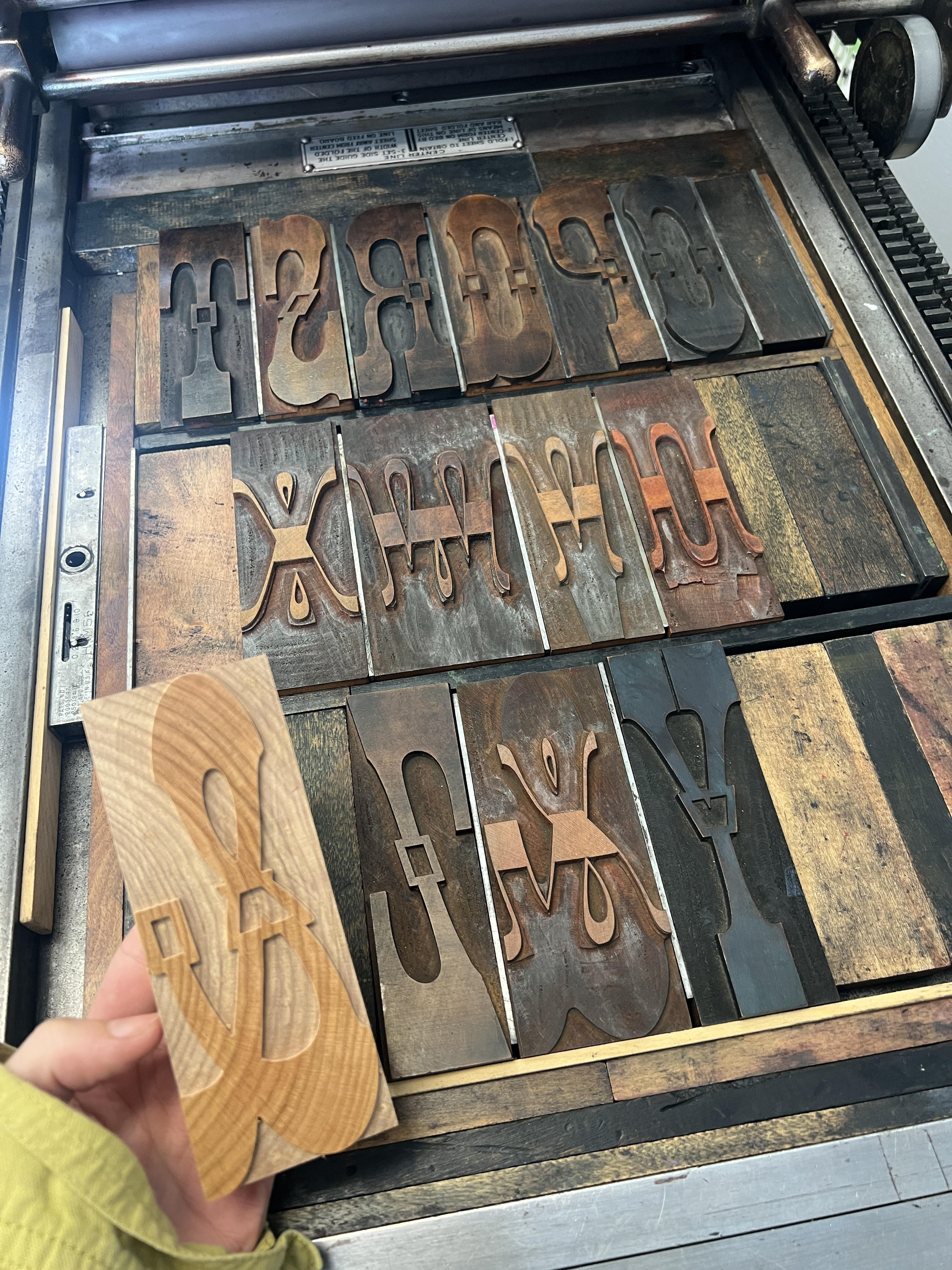
custom cut ampersand
French Antique No. 1 in 8 line & 24 line
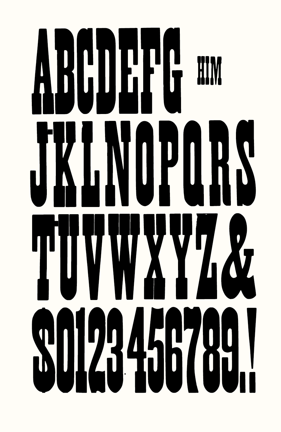
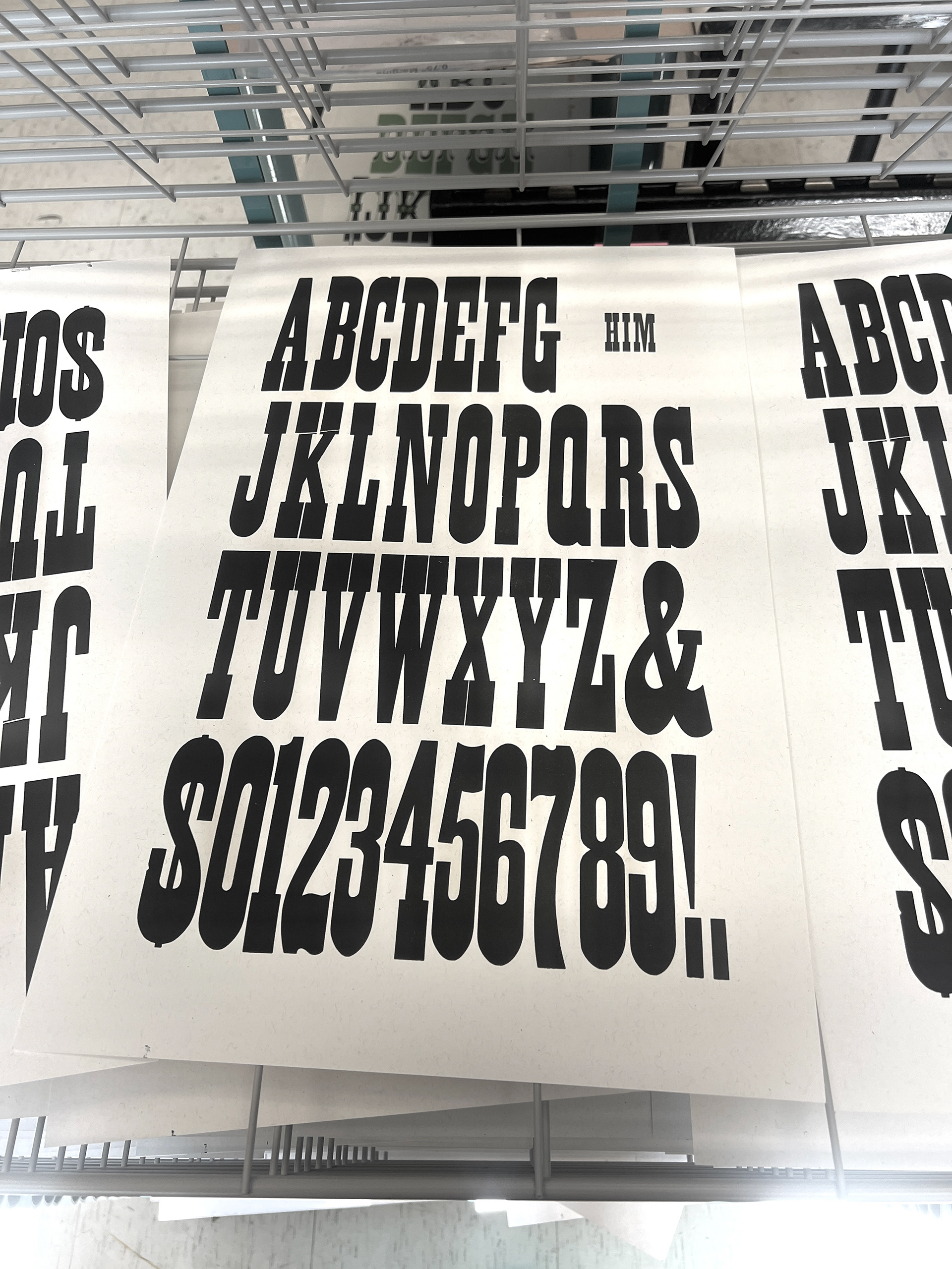
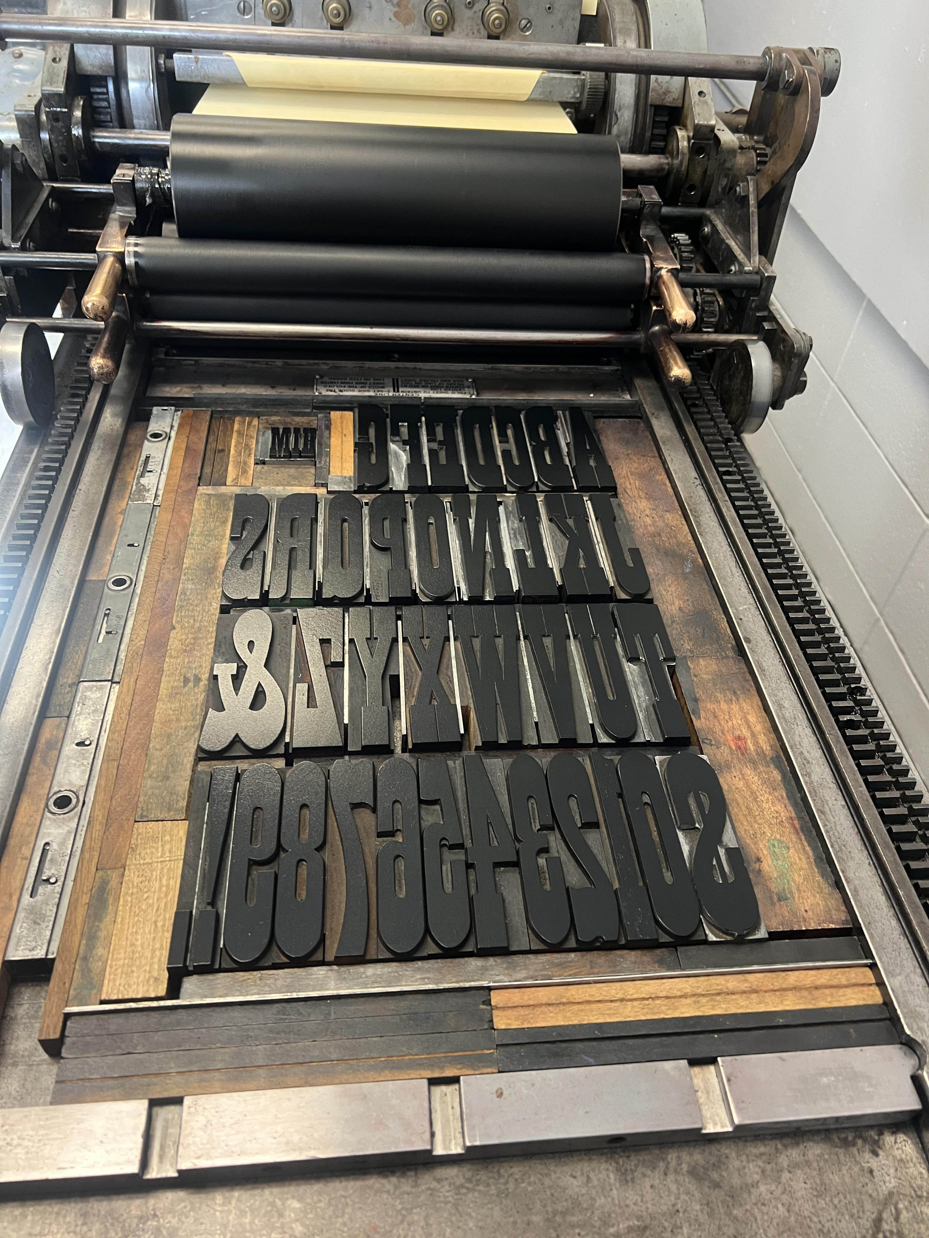
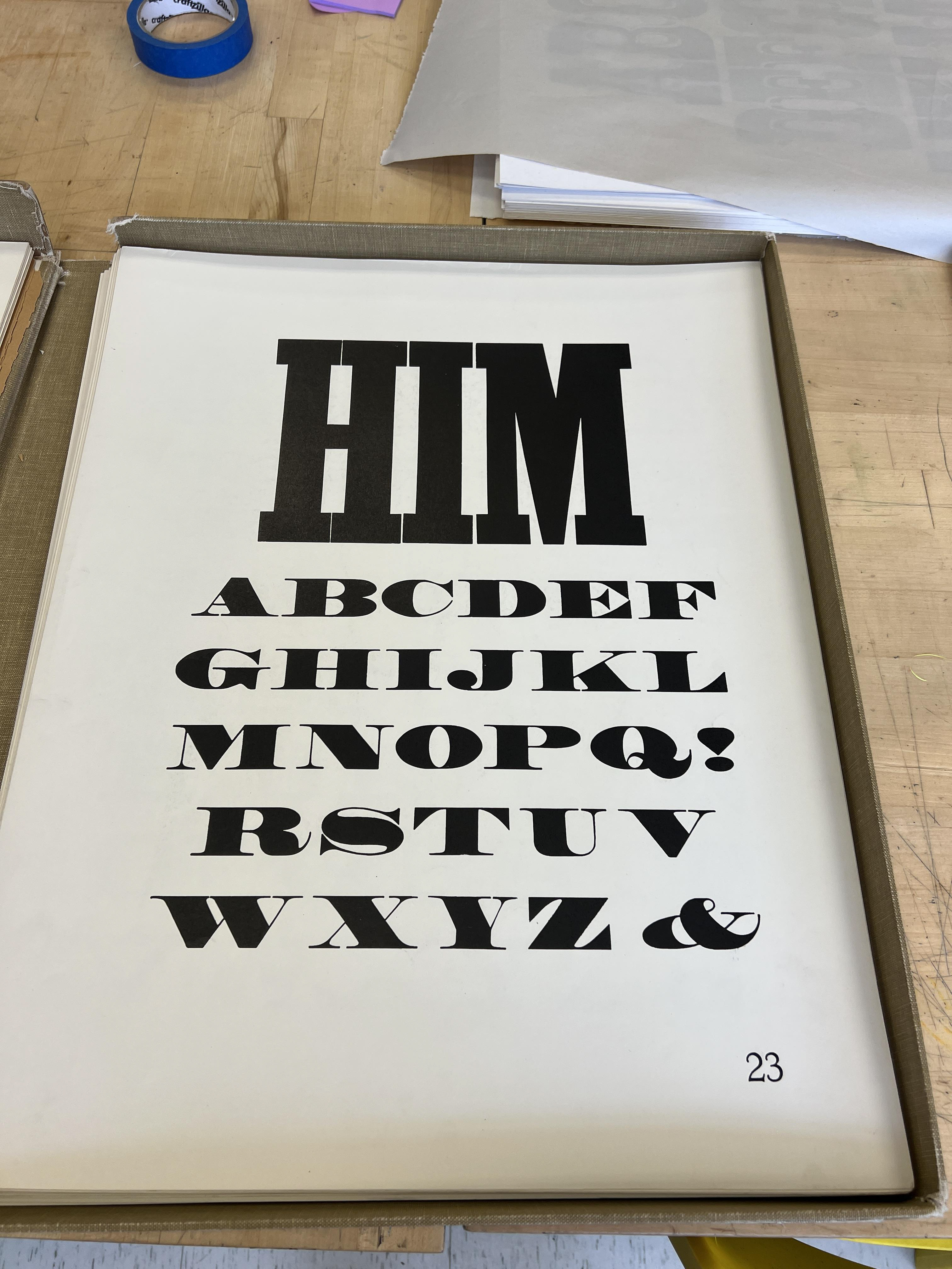
One of the first words Rob Roy Kelly used in the original folio was “HIM”, set in a large, commanding typeface that takes up a majority the composition. I wanted to respond directly to this specimen by challenging it with a similar typographic voice. This print draws heavily on a simple grid and vertical weight, challenging gender ideals in my attempt to make the new folio feel contemporary and relevant.
mockup
final print
lock up
original folio reference
More French Antique No. 1 (10 line)
The original goal for this print was to use the rest of the French Antique No. 1 in 24 and 8 line. I also wanted to finish out all the variations of sizes in a final specimen. I thought it would be funny to be self-referential and a little personal, as my mom is a gardener and I was immediately drawn to the flower border. Moving back into 2 layers was exciting and allowed me to explore more compositions.
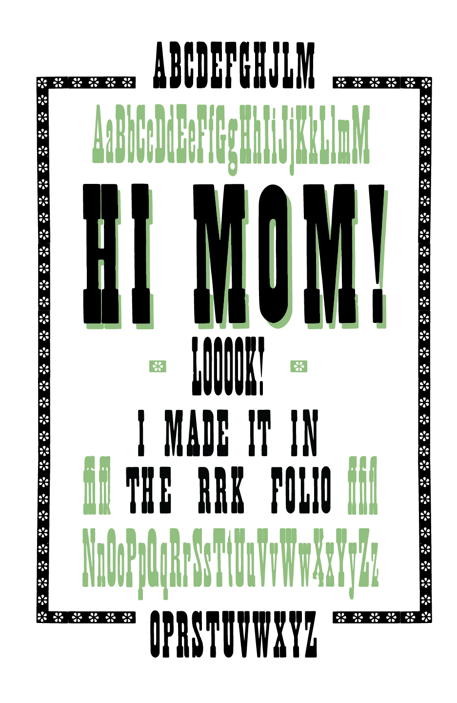
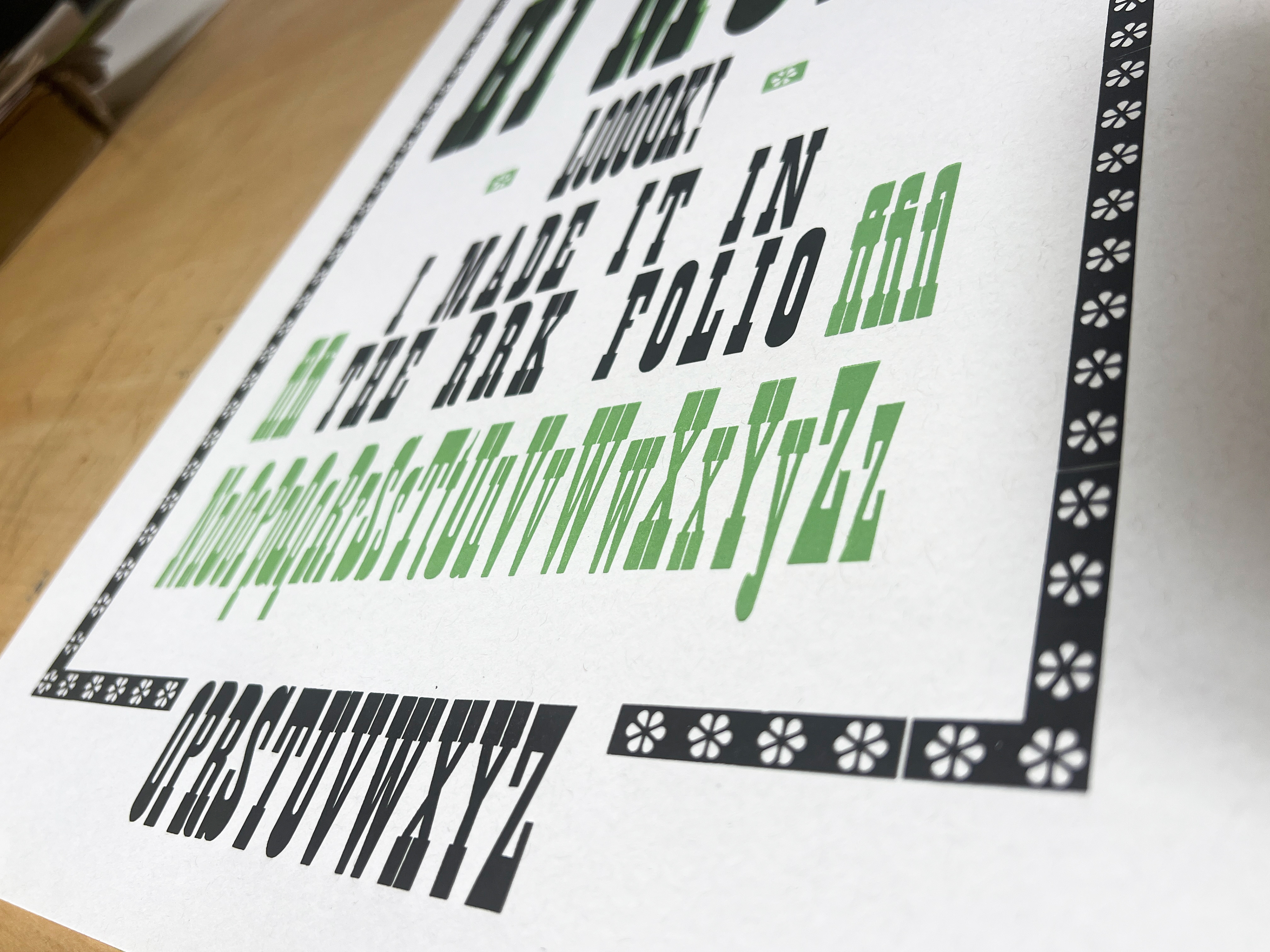
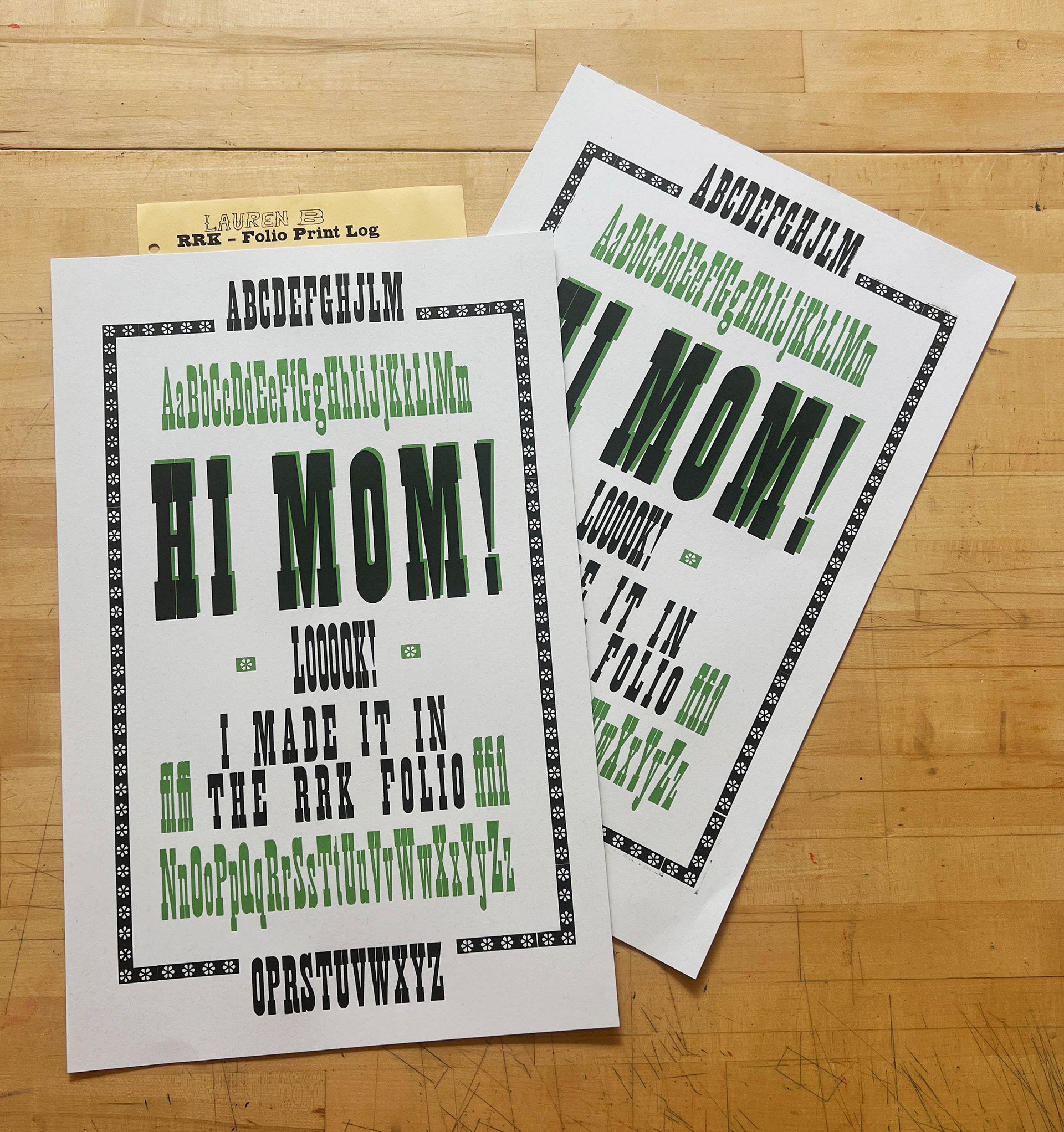
final print
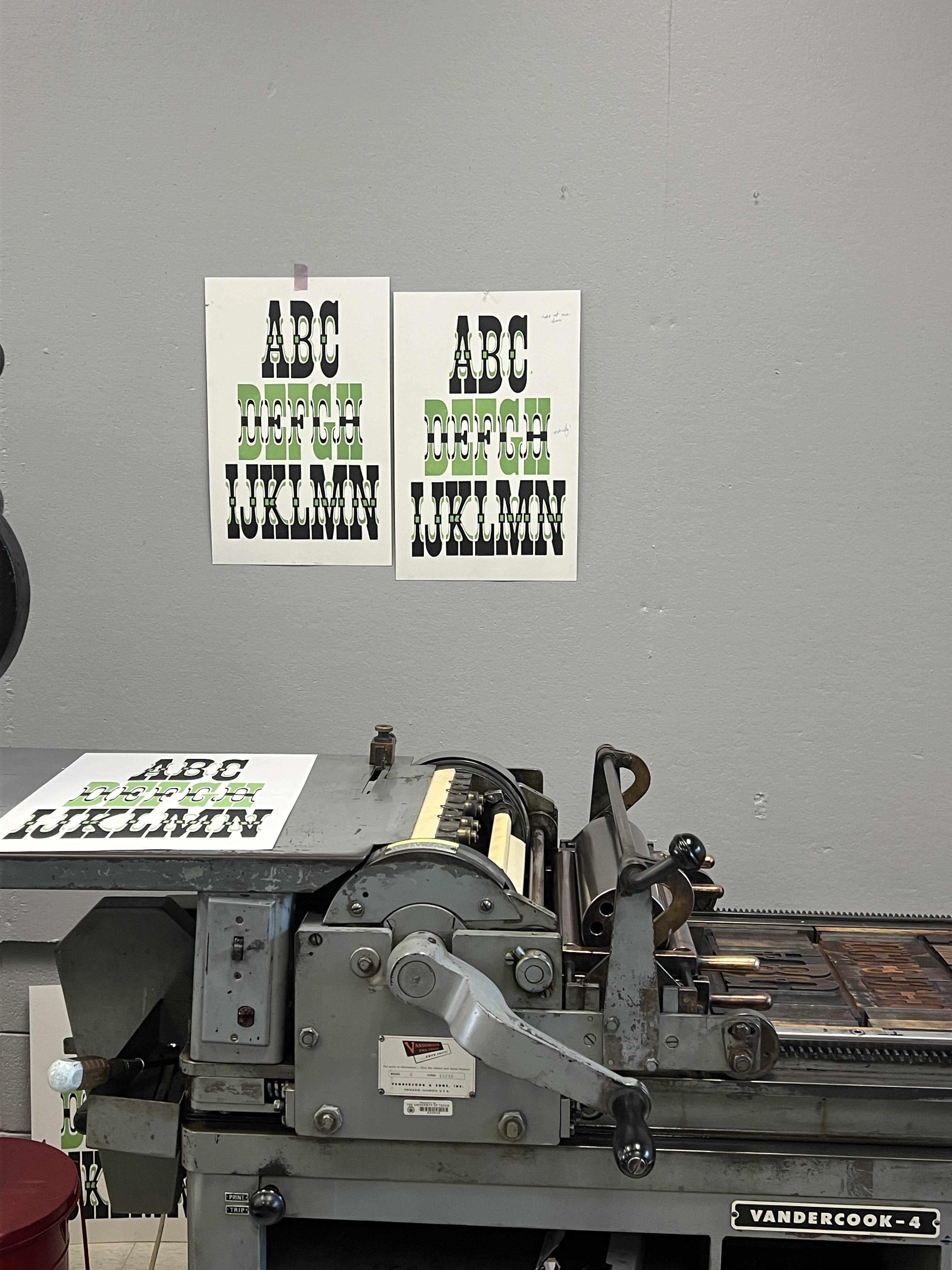
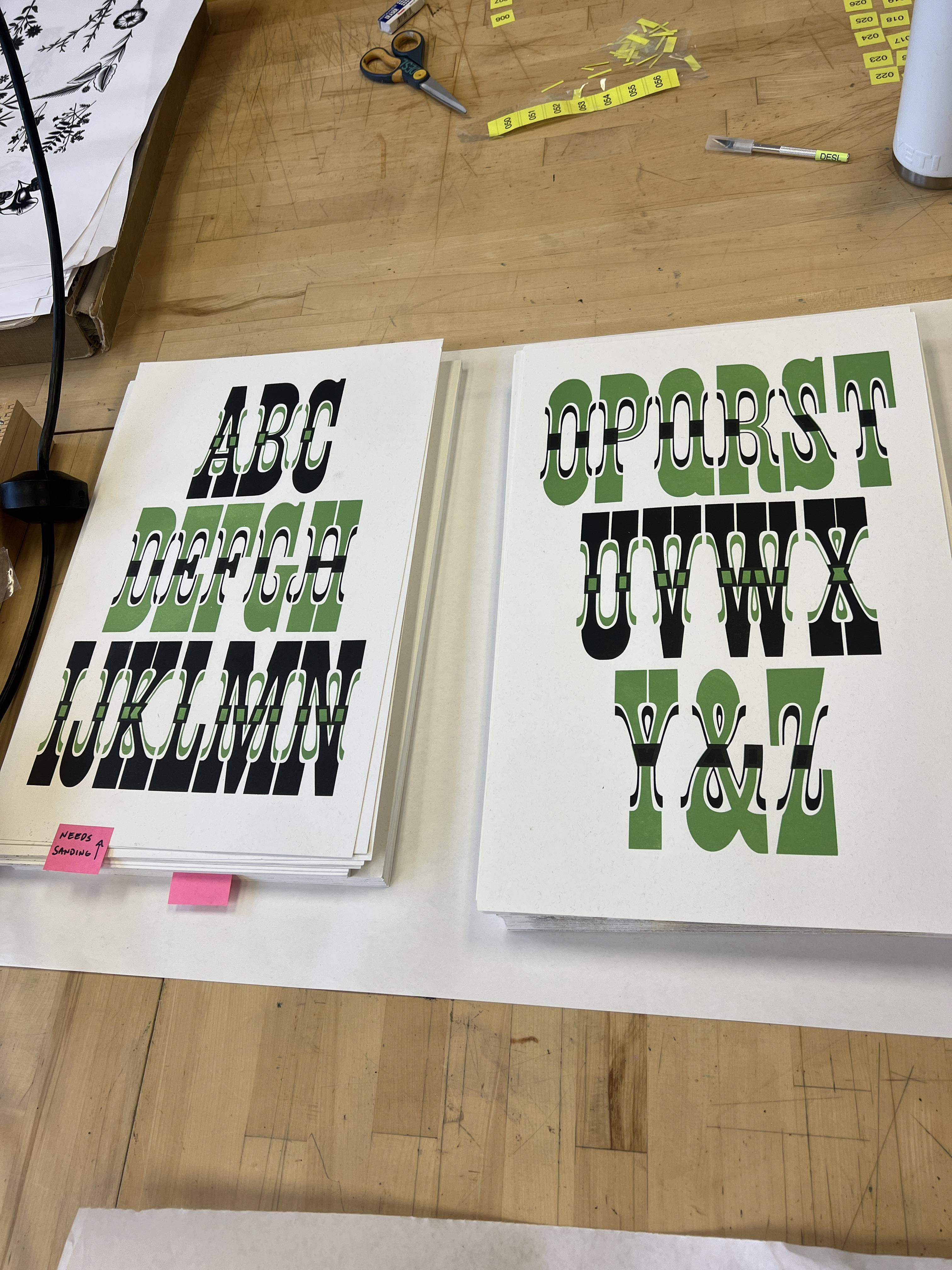
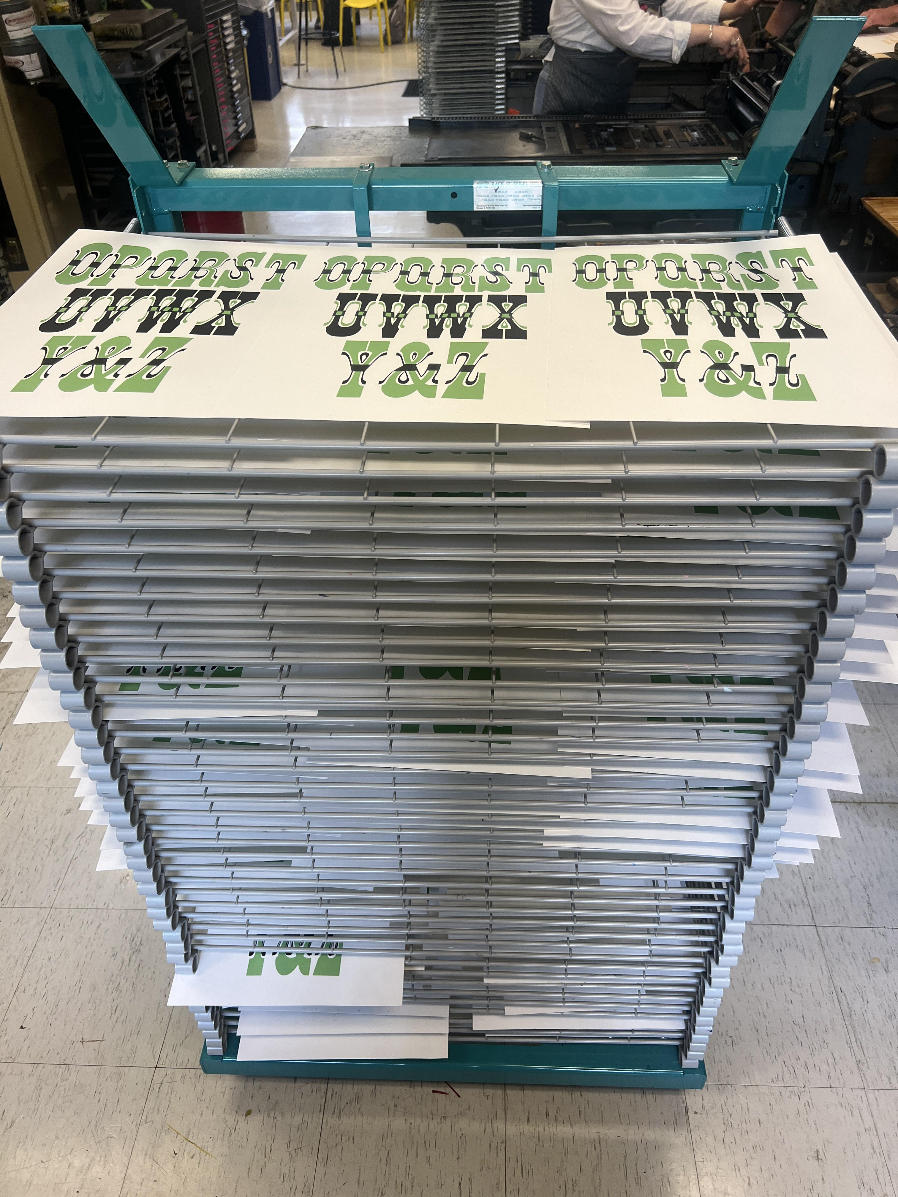
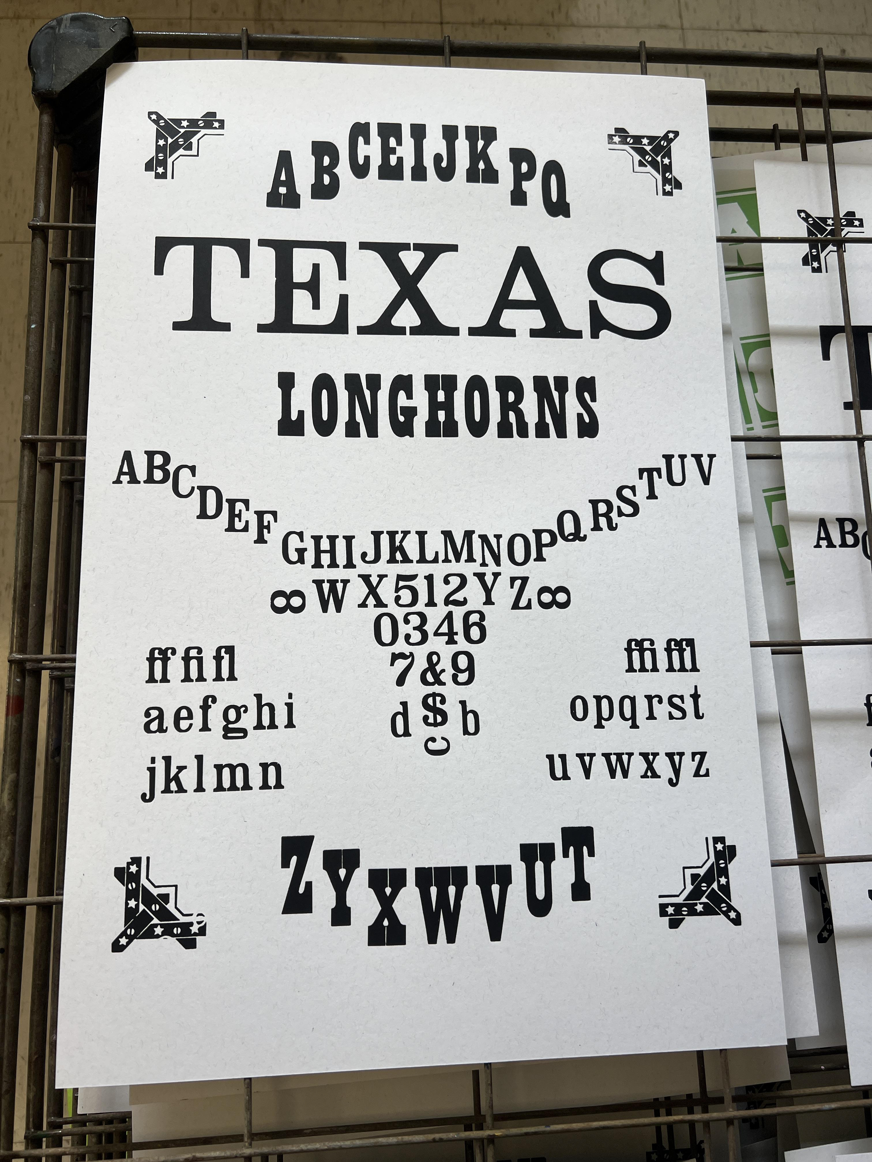
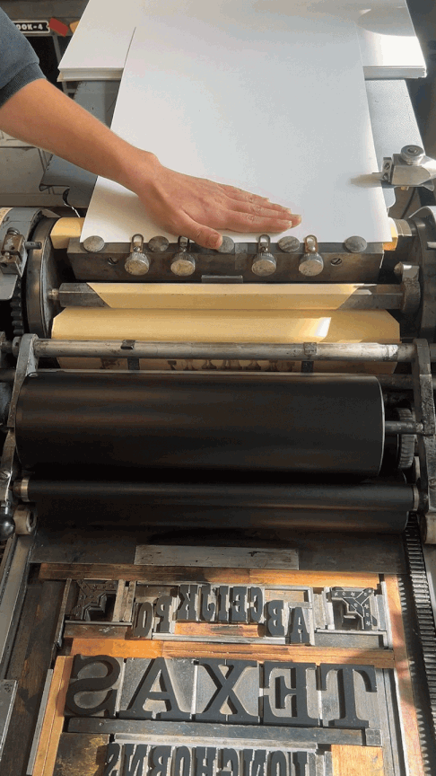
Gothic, Antique Tuscan x condensed, & no. 11
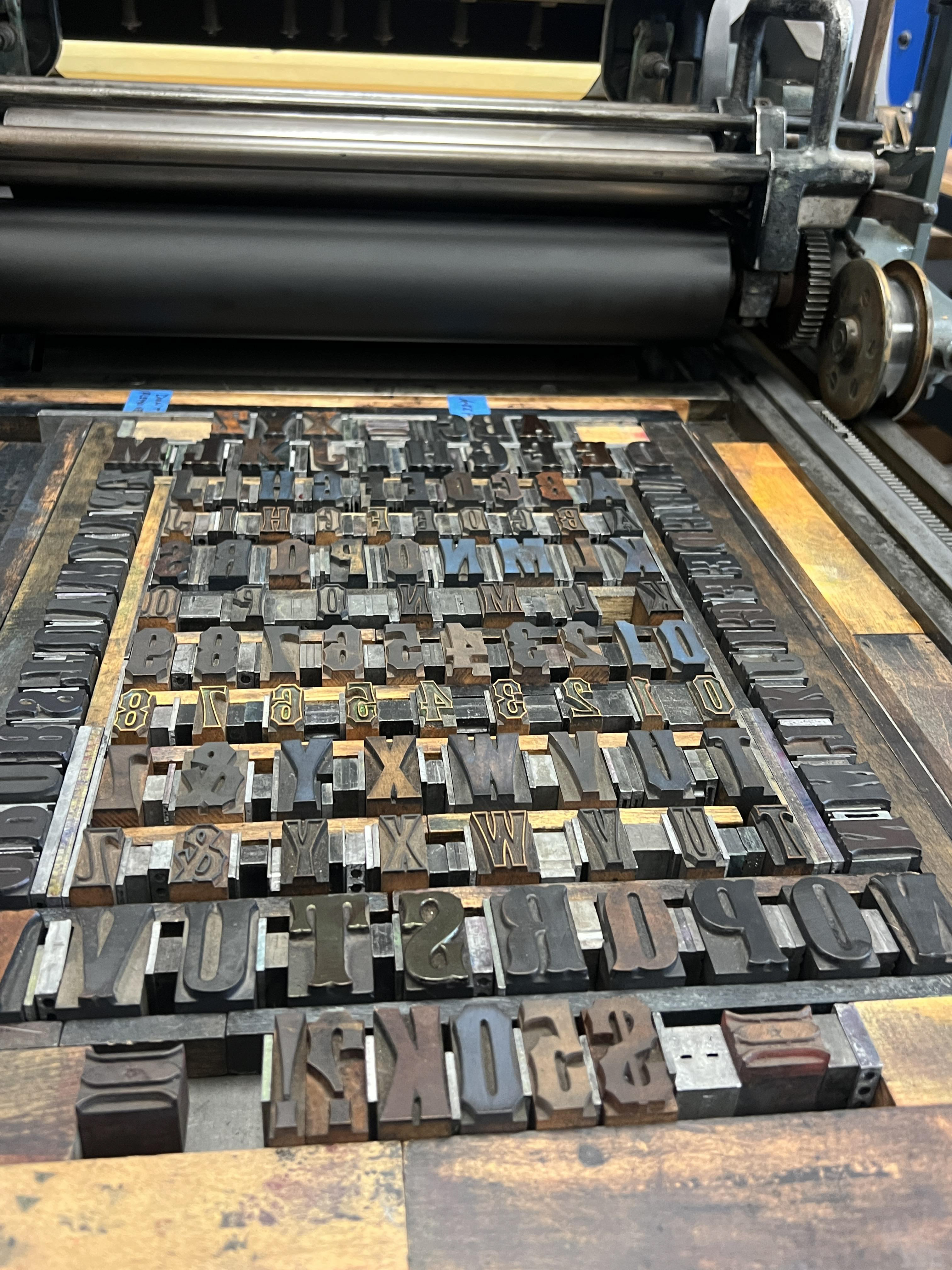
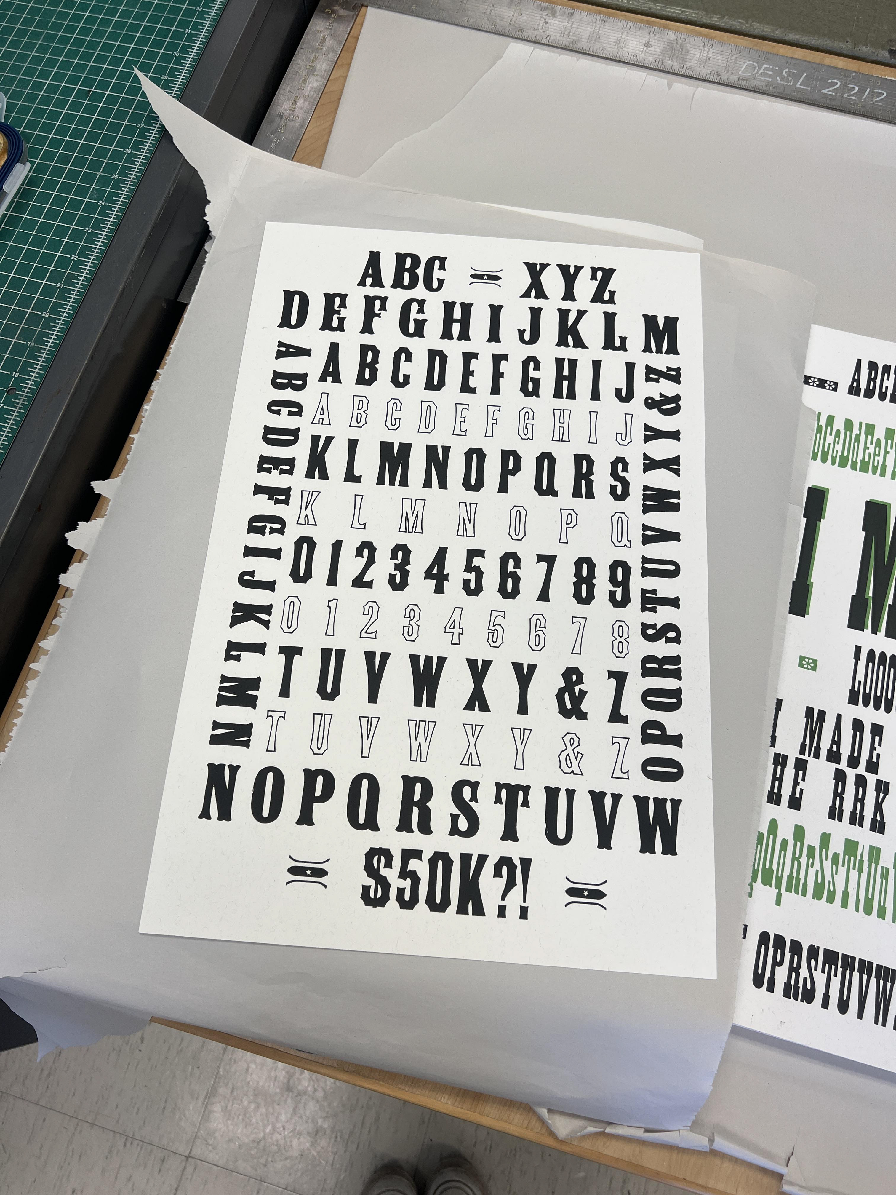
With this print, I wanted to challenge myself to arrange as many typefaces on a specimen as possible. Working with similar styles and sizes and following a strict geometric pattern allowed me to do so. The $50k is referencing the acquisition cost of the collection to the Harry Ransom center. I also wanted to explore how I could entirely fill the page without becoming overwhelming.
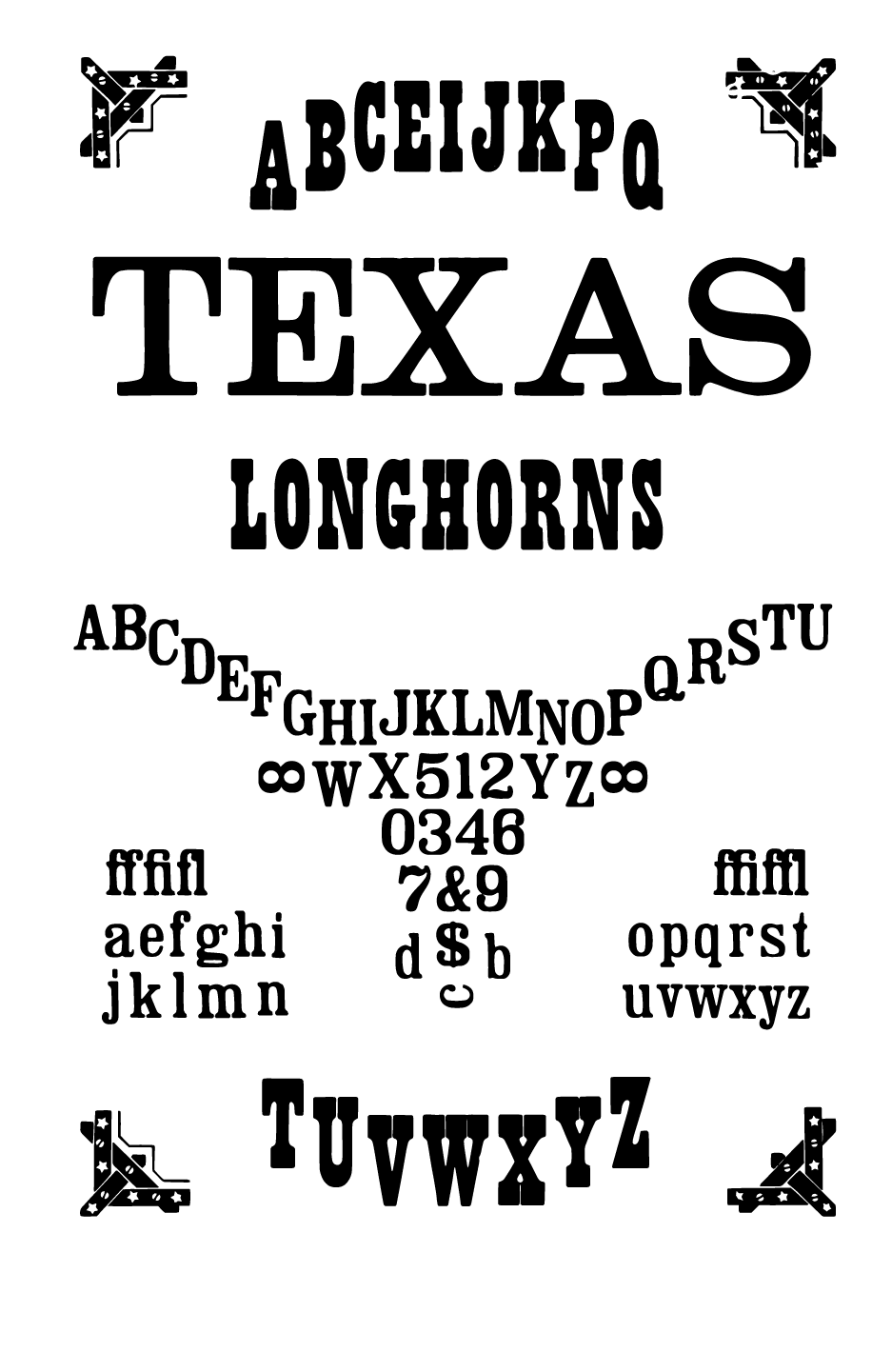
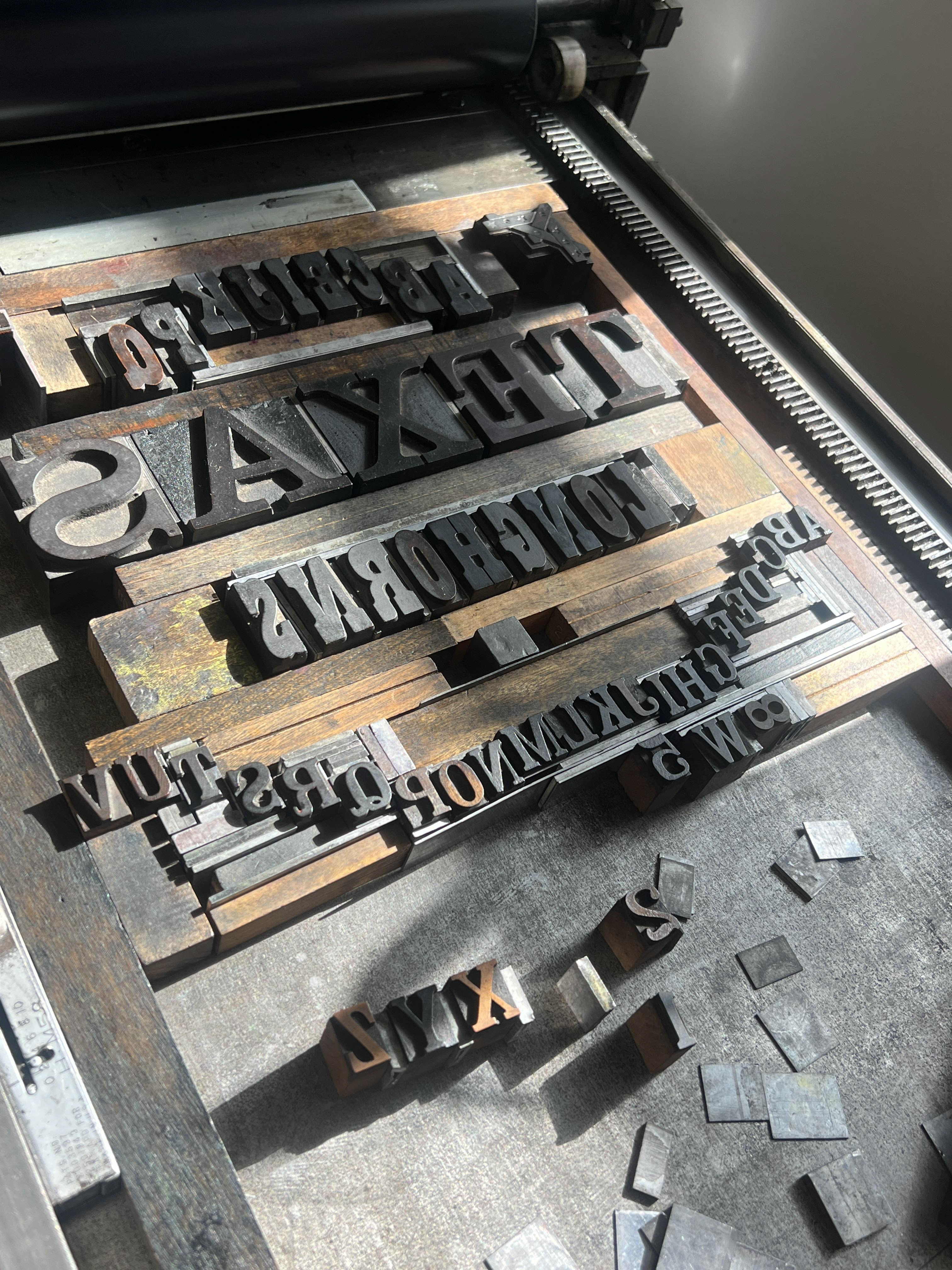
Clarendon & Ionic
The root of this print is an exploration of imagery through type and more intricate lock ups. This lock up was tedious, and often times painful - and couldn’t have been done on my own without faculty guidance. It was ultimately so worth it, and my favorite print of the summer! Ionic immediately reminded me of the University branding and I wanted to add a touch of school spirit and call to the home of the design lab/collection in the new folio.
No. 501 & Streamer No. 2
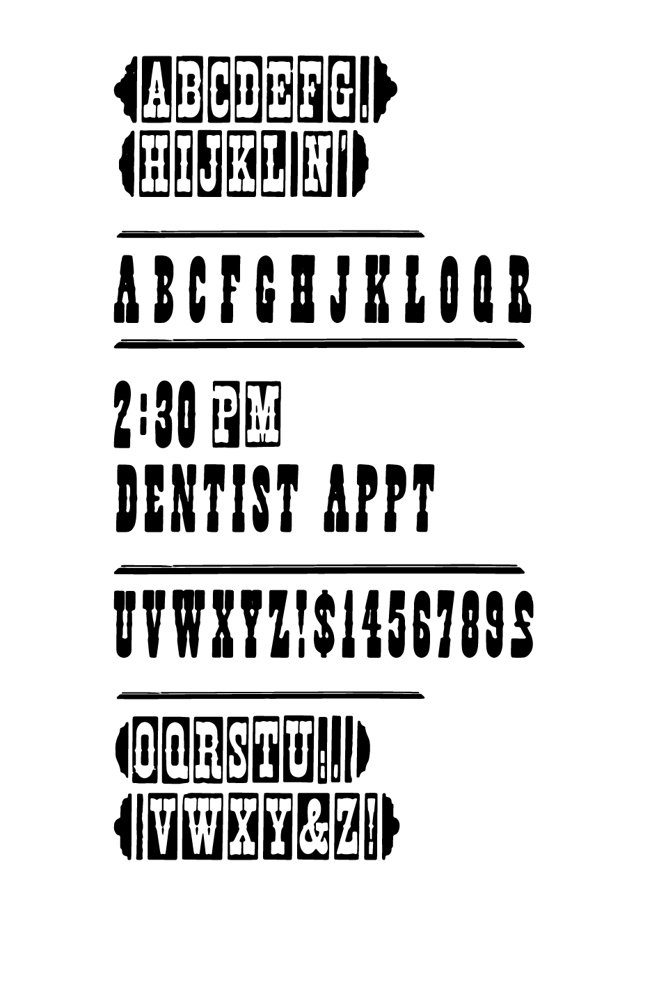
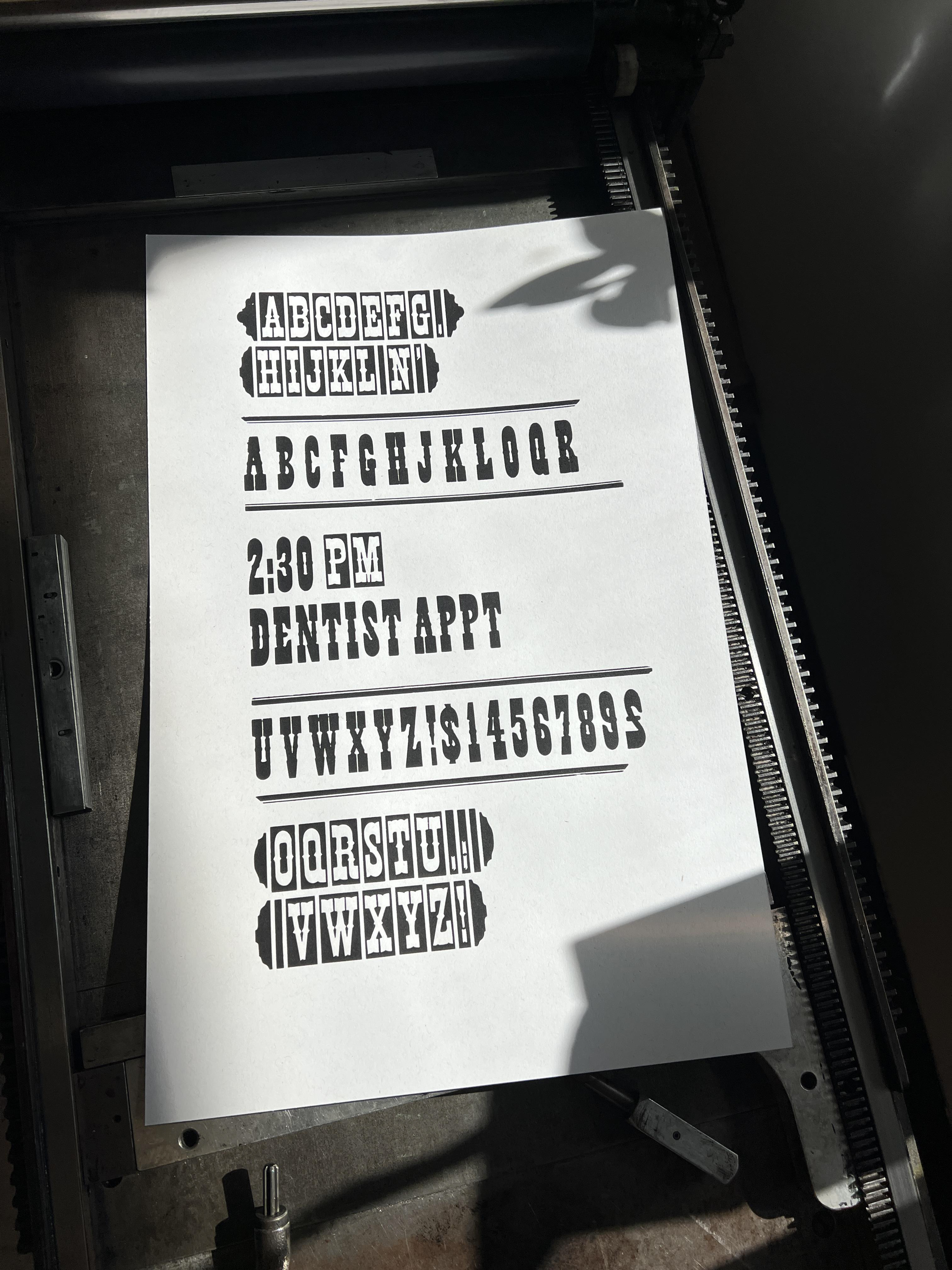
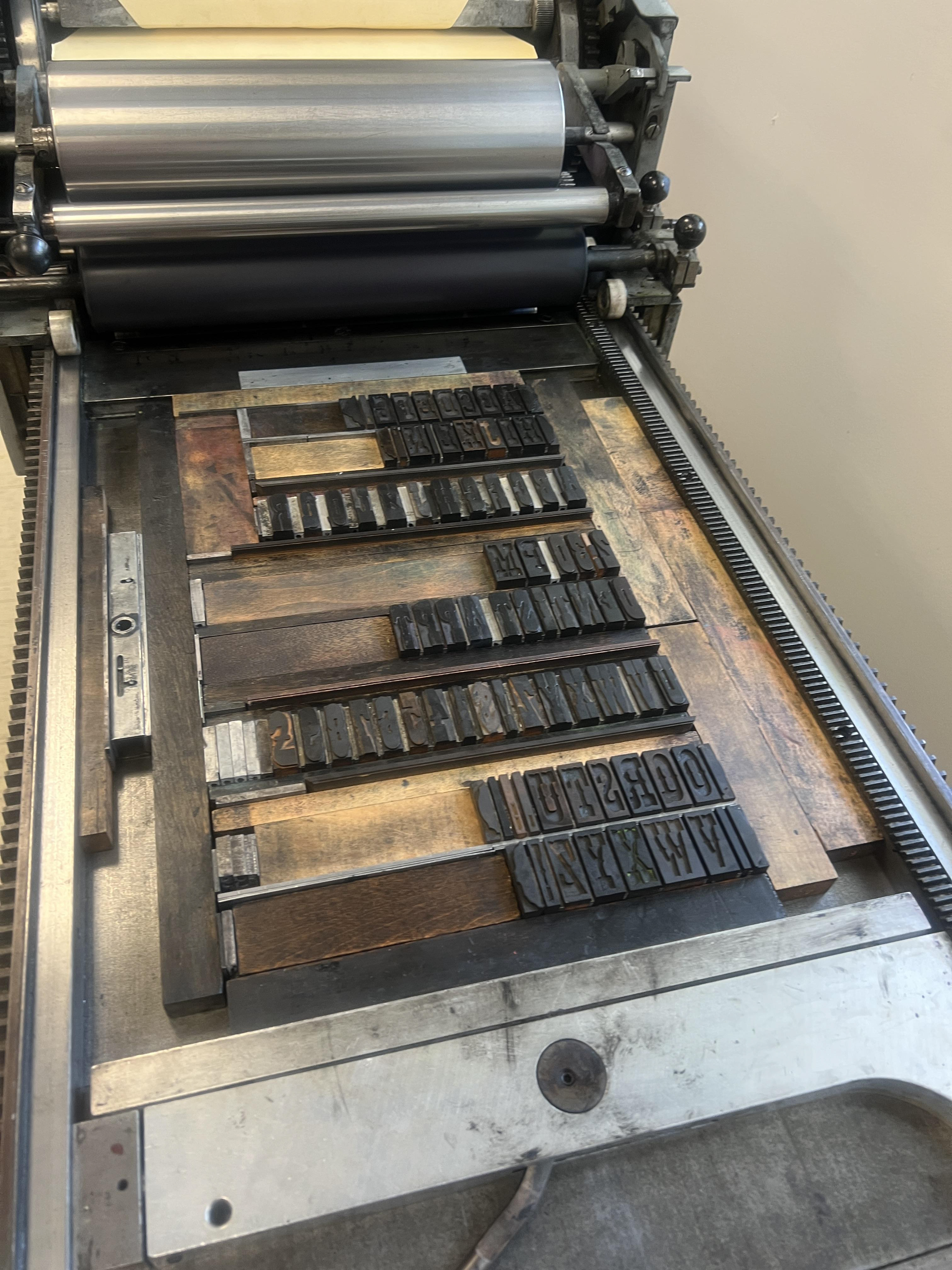
For my final print of the summer, I wanted something straightforward, simple, and effective. I was inspired by medical and administrative documentation, particularly the strict grid and alignment. I had yet to work with rules or streamers at this point, so this was a great opportunity to do so. This was my easiest of the summer, and a relaxing way to end the residency.